2025 3 Graphic Designer of the Year
Studio Najbrt (Jakub Spurný, Aleš Najbrt, Tomáš Brousil)
visual identity of the state administration of the Czech Republic
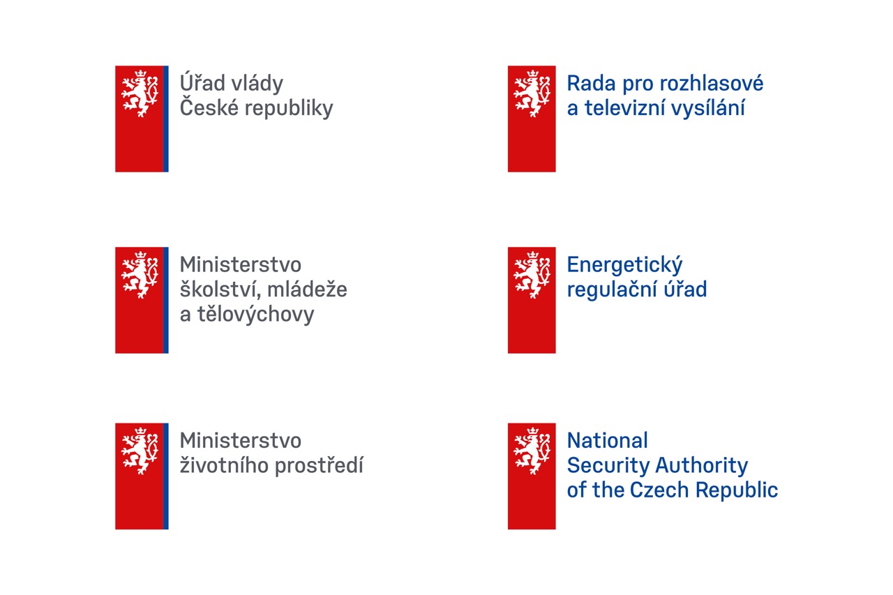
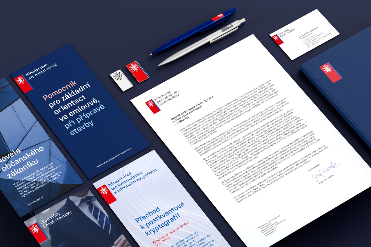
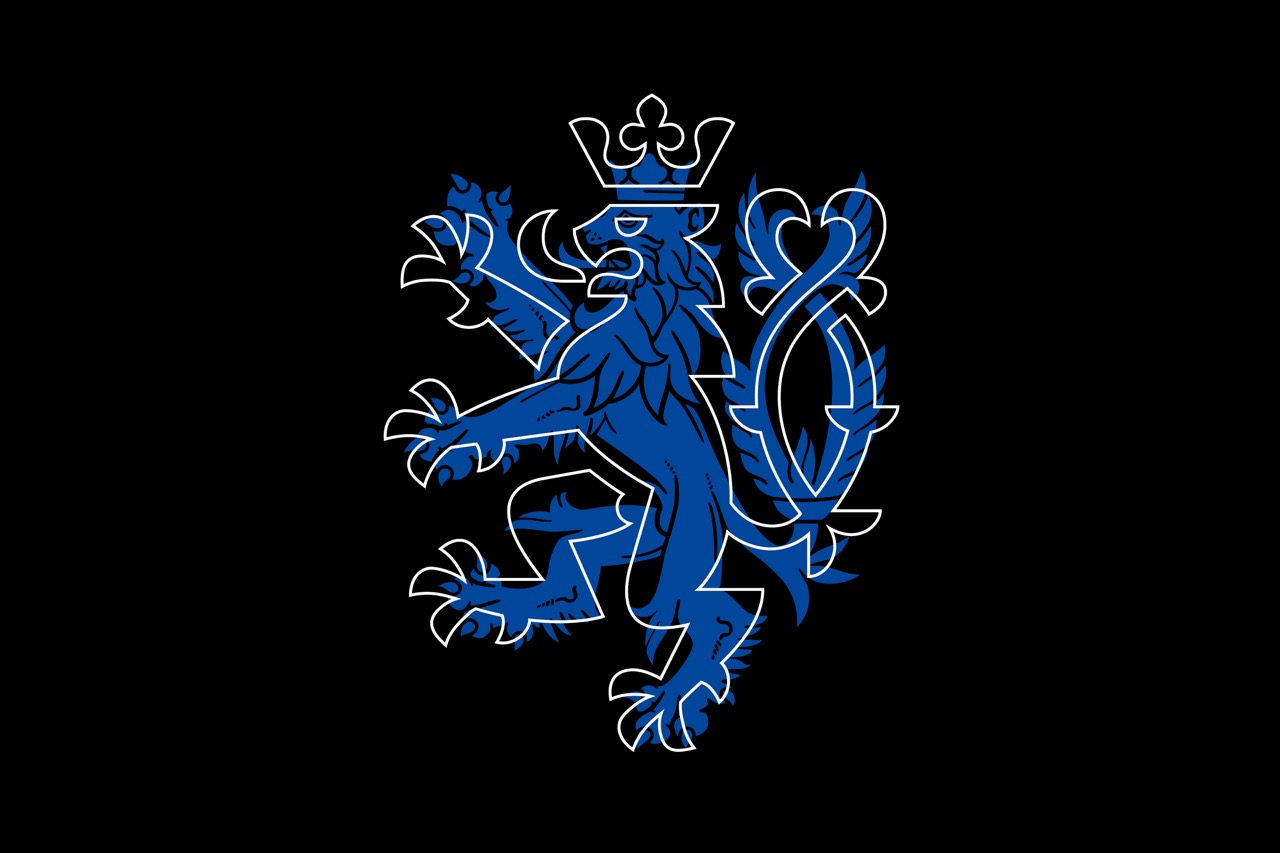
For years, experts have been calling for a visual identity which would unify the fragmented communications of the Czech state administration into one coherent whole. The state has adopted a unified visual presentation for all state institutions to facilitate communication with its citizens who will be better able to orient themselves in its state structures and will have a sense of greater stability and safety when communicating with state authorities. It also shows international partners the Czech Republic’s firm integration in European structures where unified visual communication has become the norm.
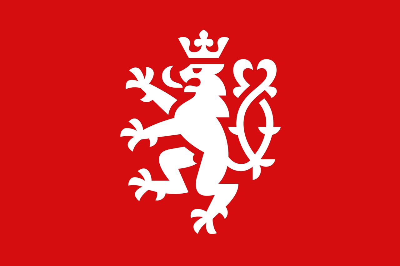
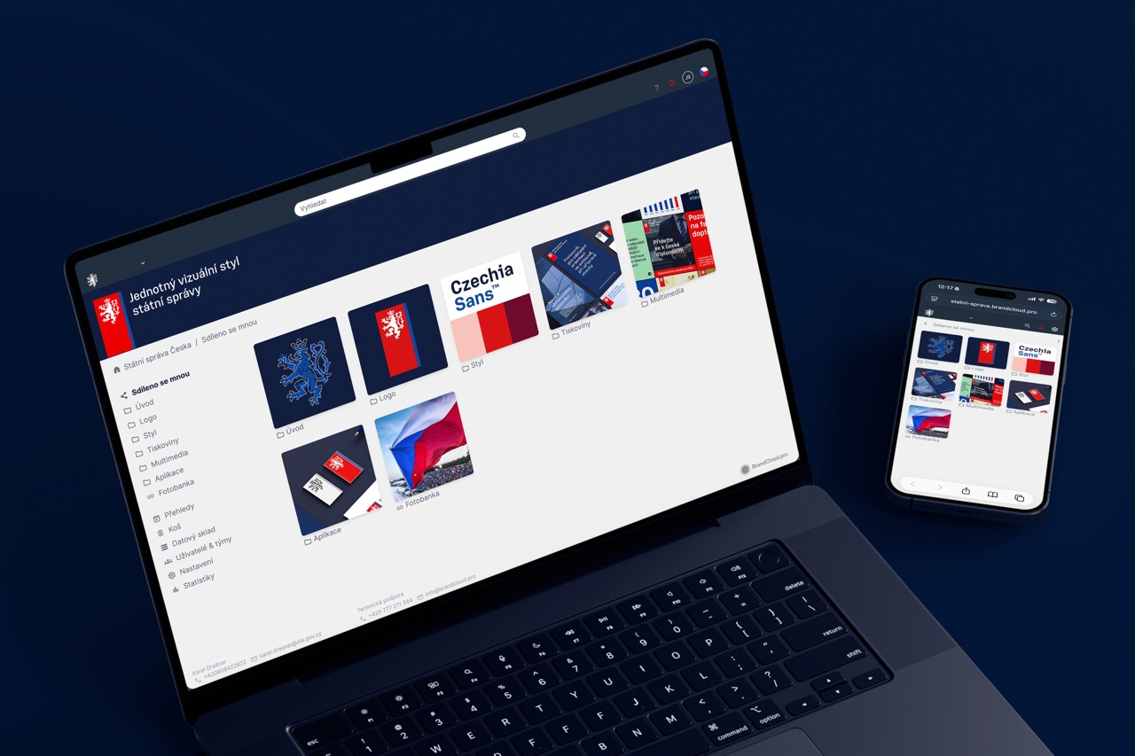
The new visual identity’s most visible feature is the updated symbol of the Czech lion and the color scheme referencing the red, white and blue of the Czech flag, used as part of a well-developed, logical and organic hierarchy. The modernized symbol of the lion has not lost anything of its majesty and dignity, and corresponds well with the concept’s elegant and detailed solution, as well as with the non-linear Czechia Sans type developed by typographer Tomáš Brousil. Apart from the logo itself and the related visual style, the project also includes a detailed style guide for all relevant printed and digital materials.
The state administration’s new visual identity is not only a formally and functionally striking project but is also one of the many steps towards achieving a more effective administration of public resources and helping the country’s reintegration into the geopolitical structures of which it has been an integral part throughout history. Its easy applicability and legibility, as well as the dignity and elegance of the state administration’s visual identity, constitute seminal prerequisites for its long-term sustainability, regardless of the actual political situation.
Linda Kudrnovská
Number of votes: 13
Voted: Andrea Březinová
Petra Cieslar
Karolína Davidová
Linda Kudrnovská
Jan Mergl
Kristýna Mazánková
Veronika Pařízková
Lukáš Pilka
Jan Press
Zuzana Sedmerová
Martina Schneider Králová
Rostislav Vaněk
Jana Vinšová
2024 Graphic Designer of the Year
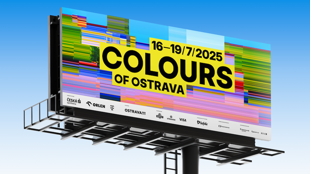
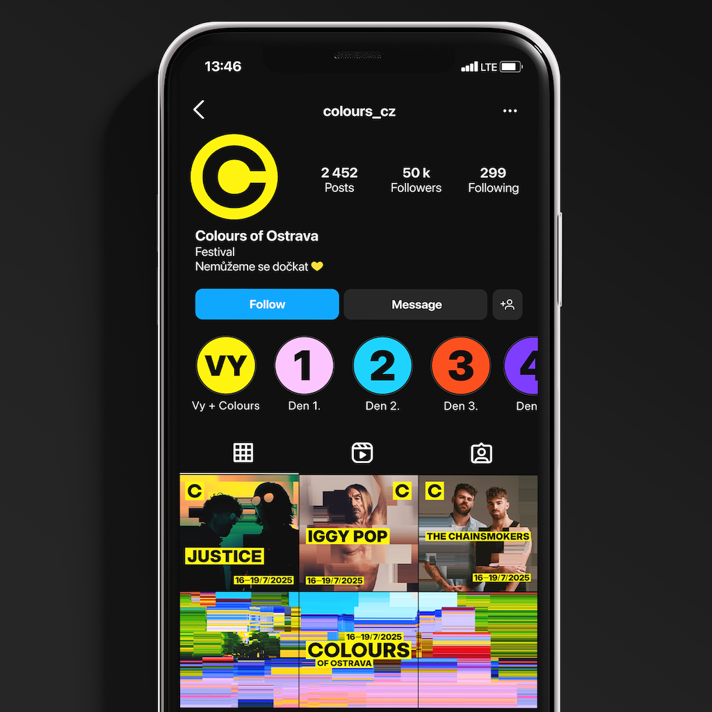
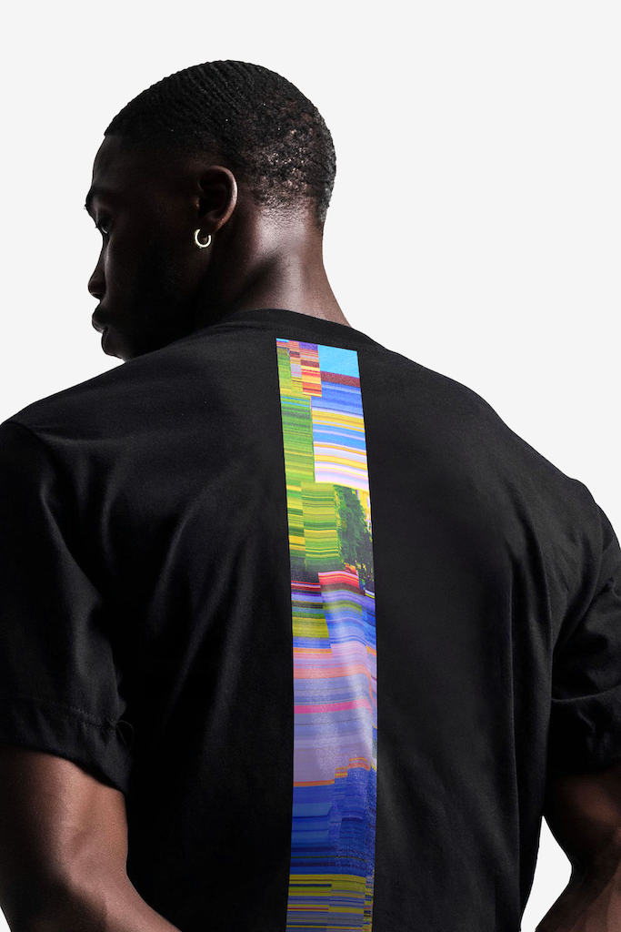
Studio Najbrt (Daniel Šmíra, Zuzana Lednická)
visual identity for Colours of Ostrava
2024 Graphic Designer of the Year
Studio Najbrt (Jonatan Kuna, Aleš Najbrt)
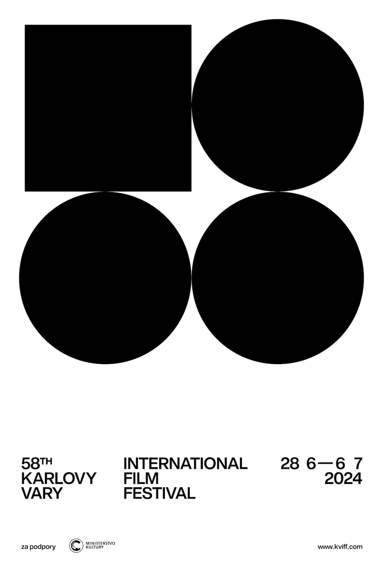
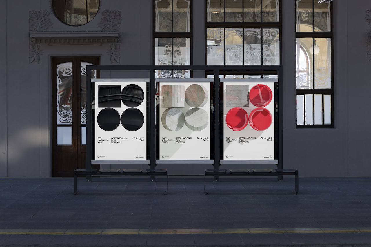
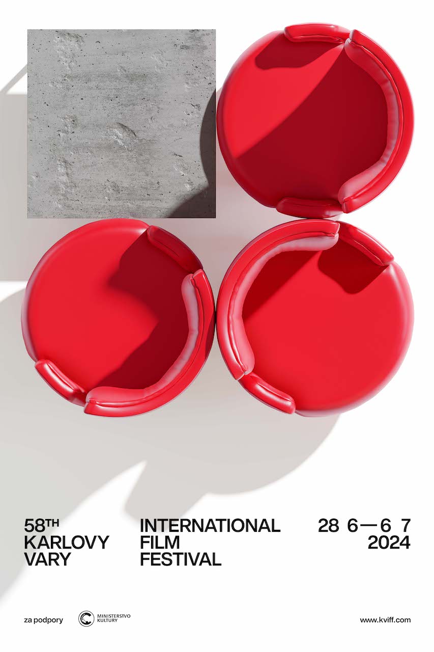
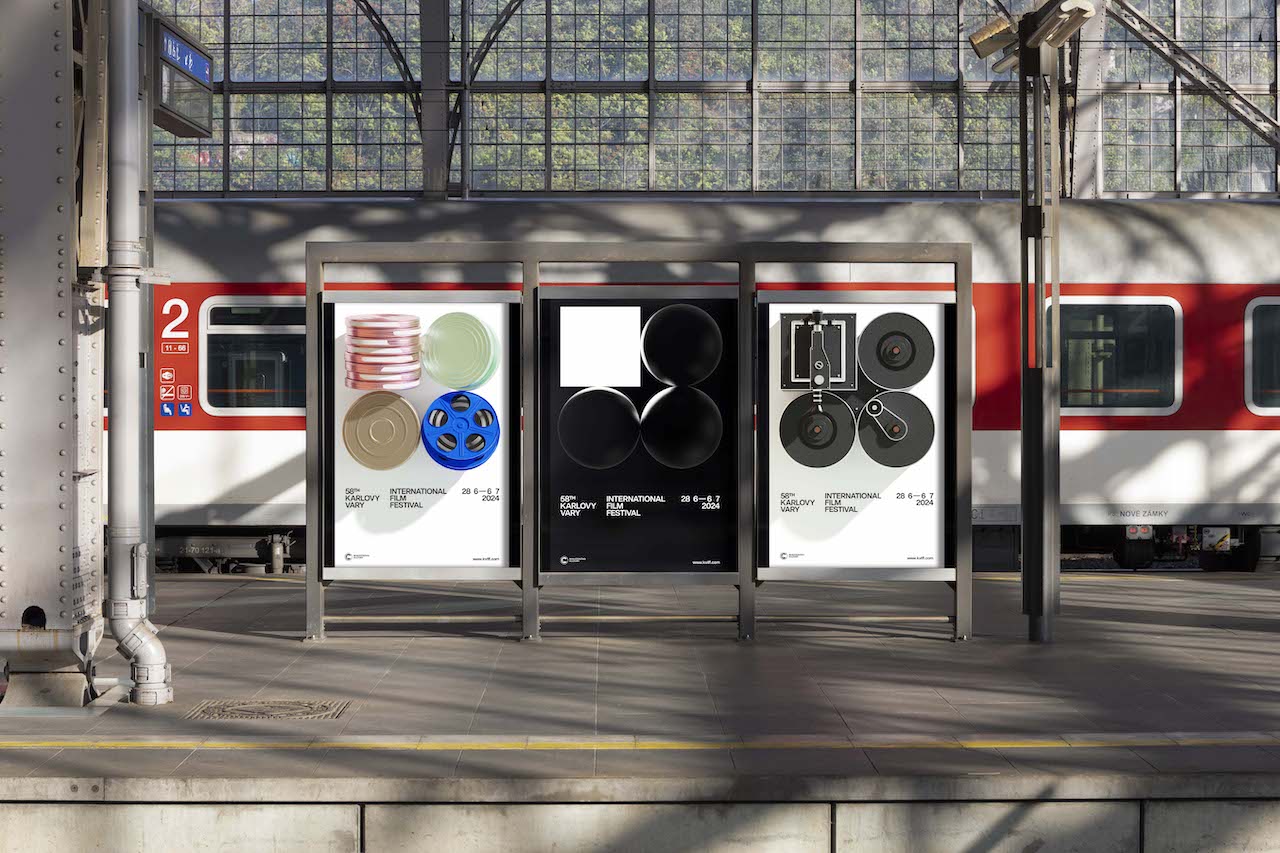
visual identity for the 58th Karlovy Vary International Film Festival
2022 Graphic Designer of the Year
Studio Najbrt (Jonatan Kuna, Zuzana Lednická)
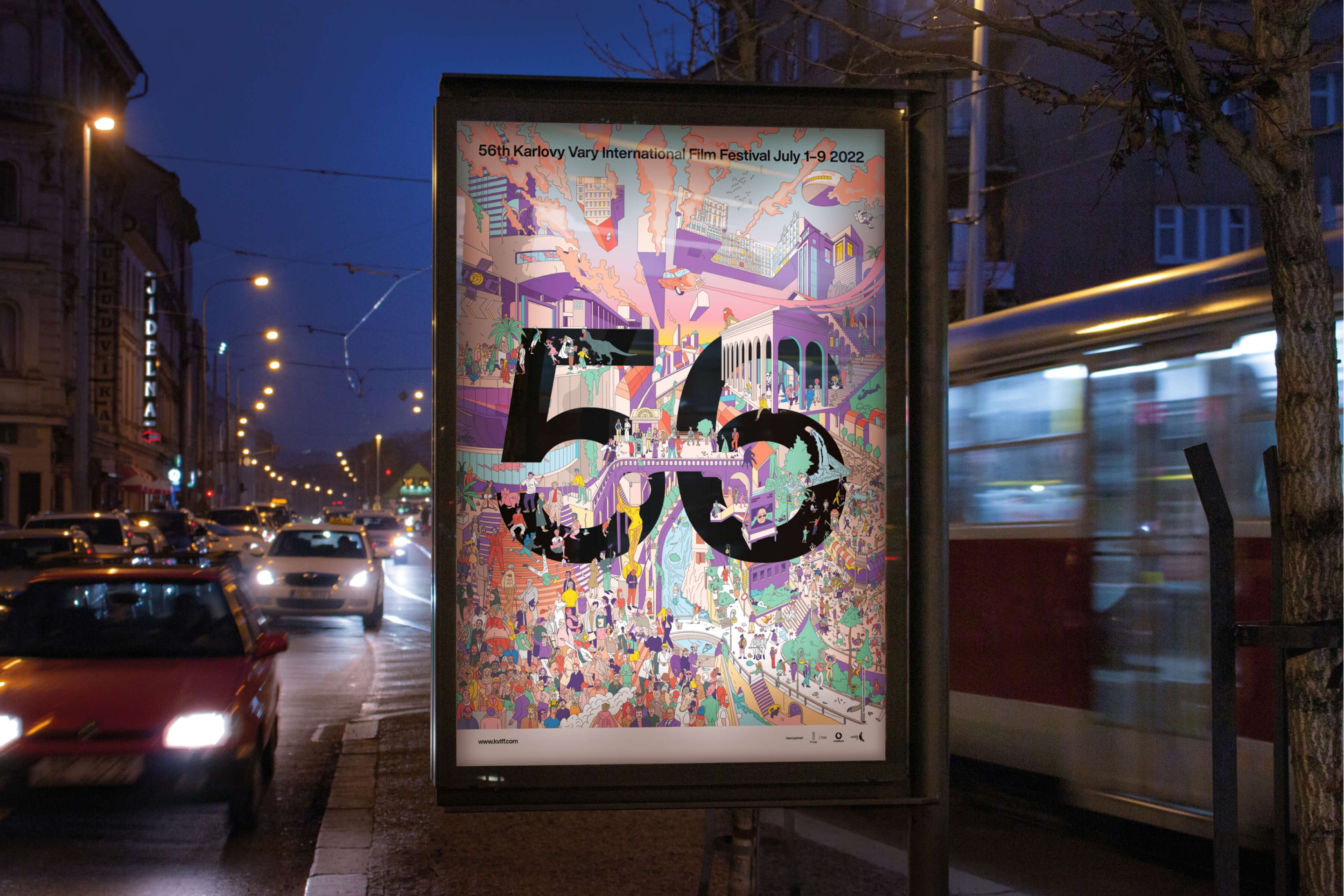
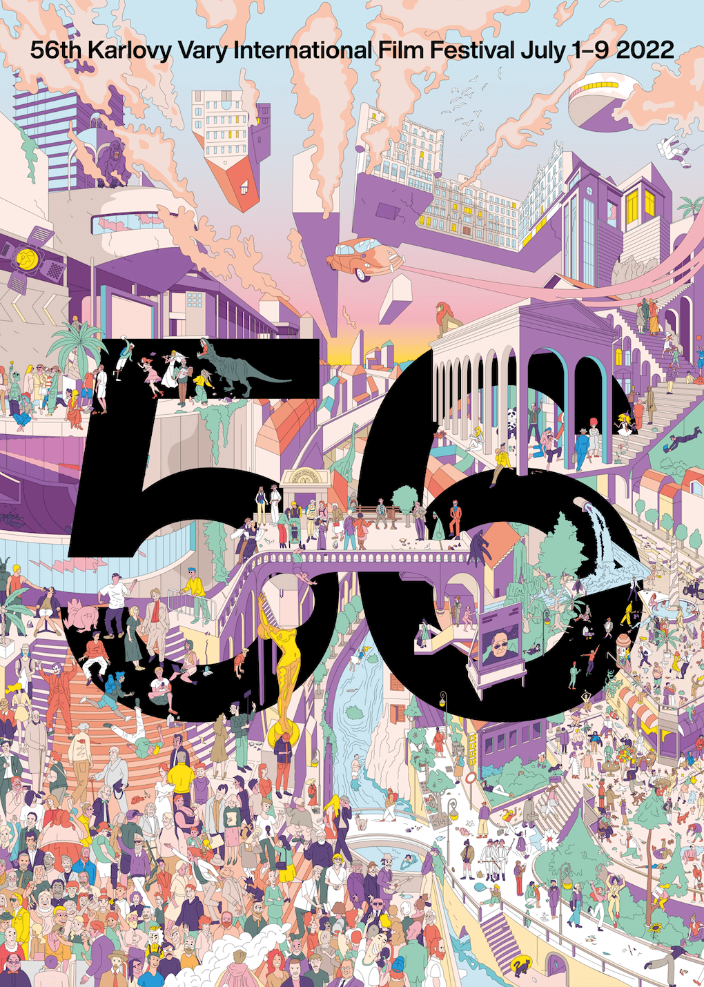
visual style for the 56th Karlovy Vary International Film Festival
2021 Graphic Designer of the Year
Studio Najbrt (Zuzana Lednická)
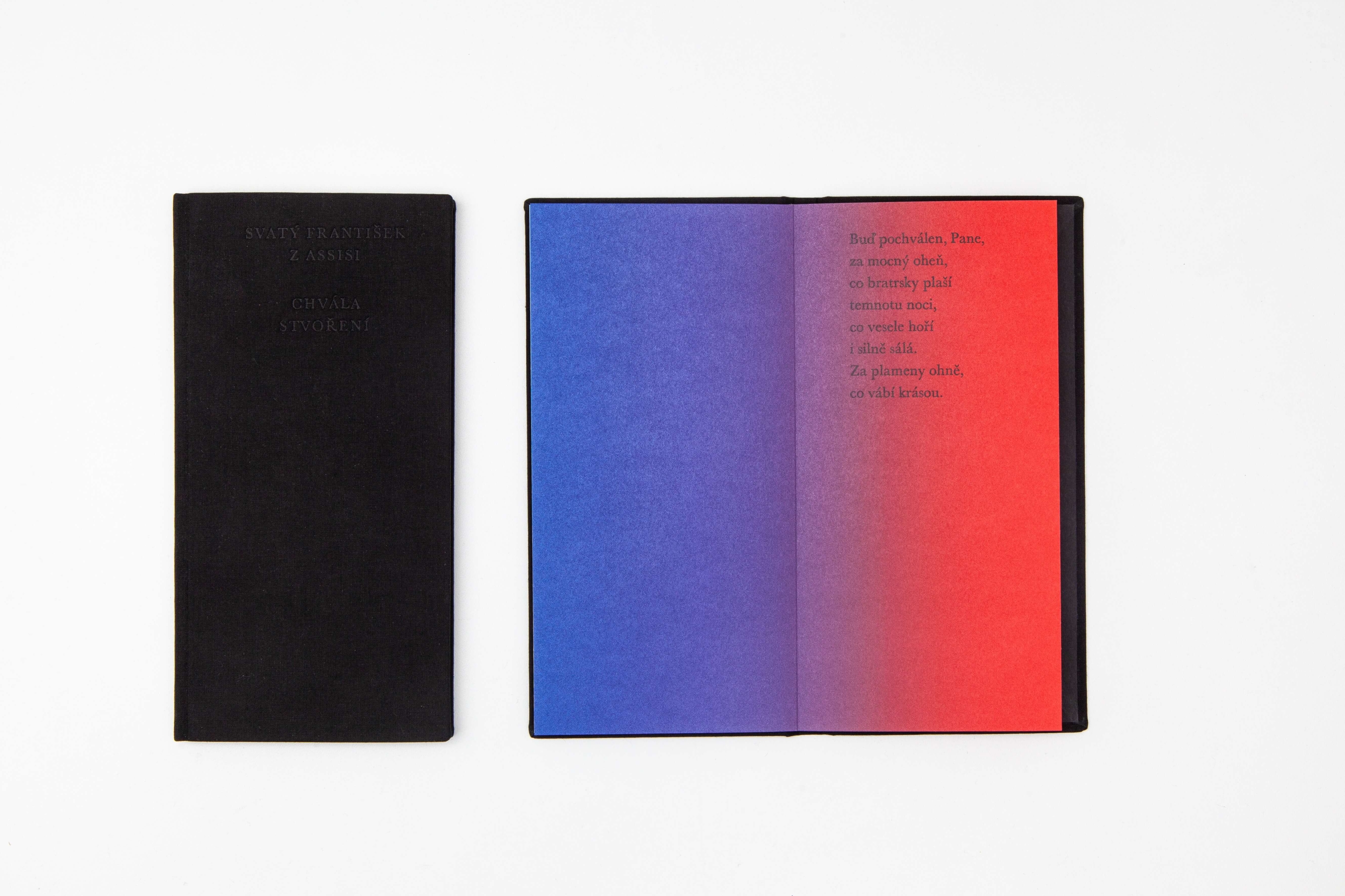
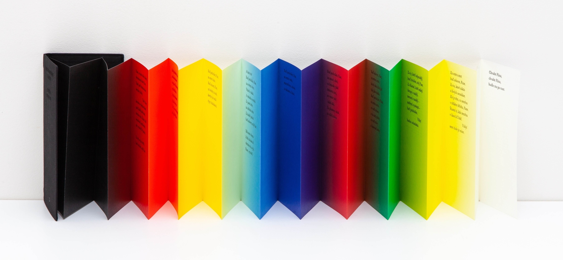
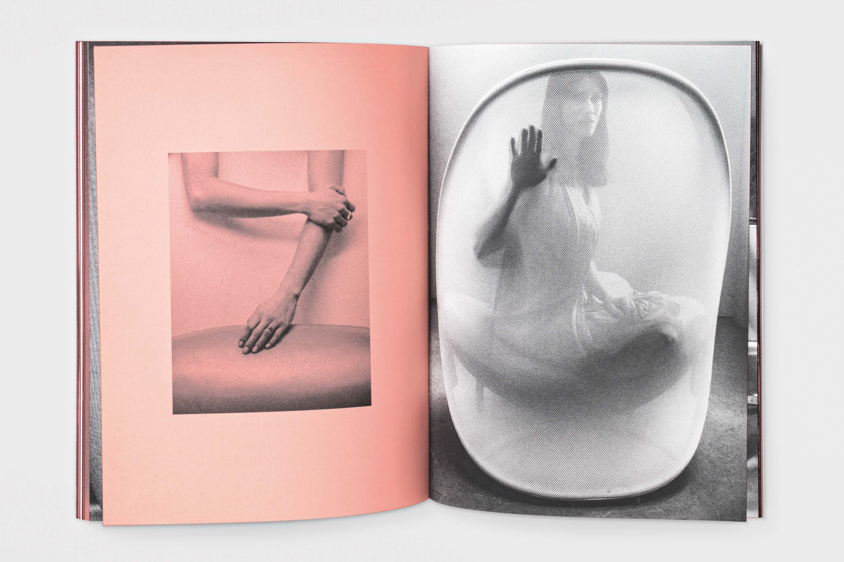
graphic design for the book Sv. František z Assisi: Chvála stvoření (Václav Havlůj), graphic design for the catalog Lucie Koldová: Lightness (Moravian Gallery in Brno)
2021 Graphic Designer of the Year
Studio Najbrt (Jakub Spurný, Aleš Najbrt, Tomáš Brousil)
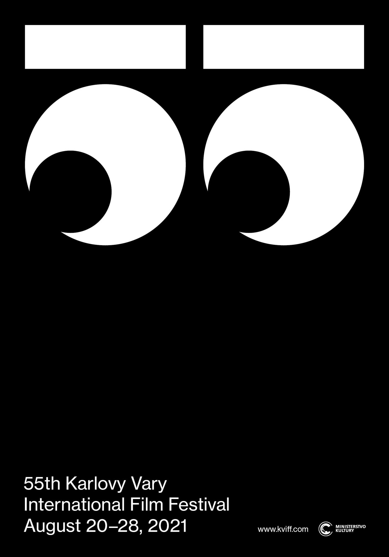
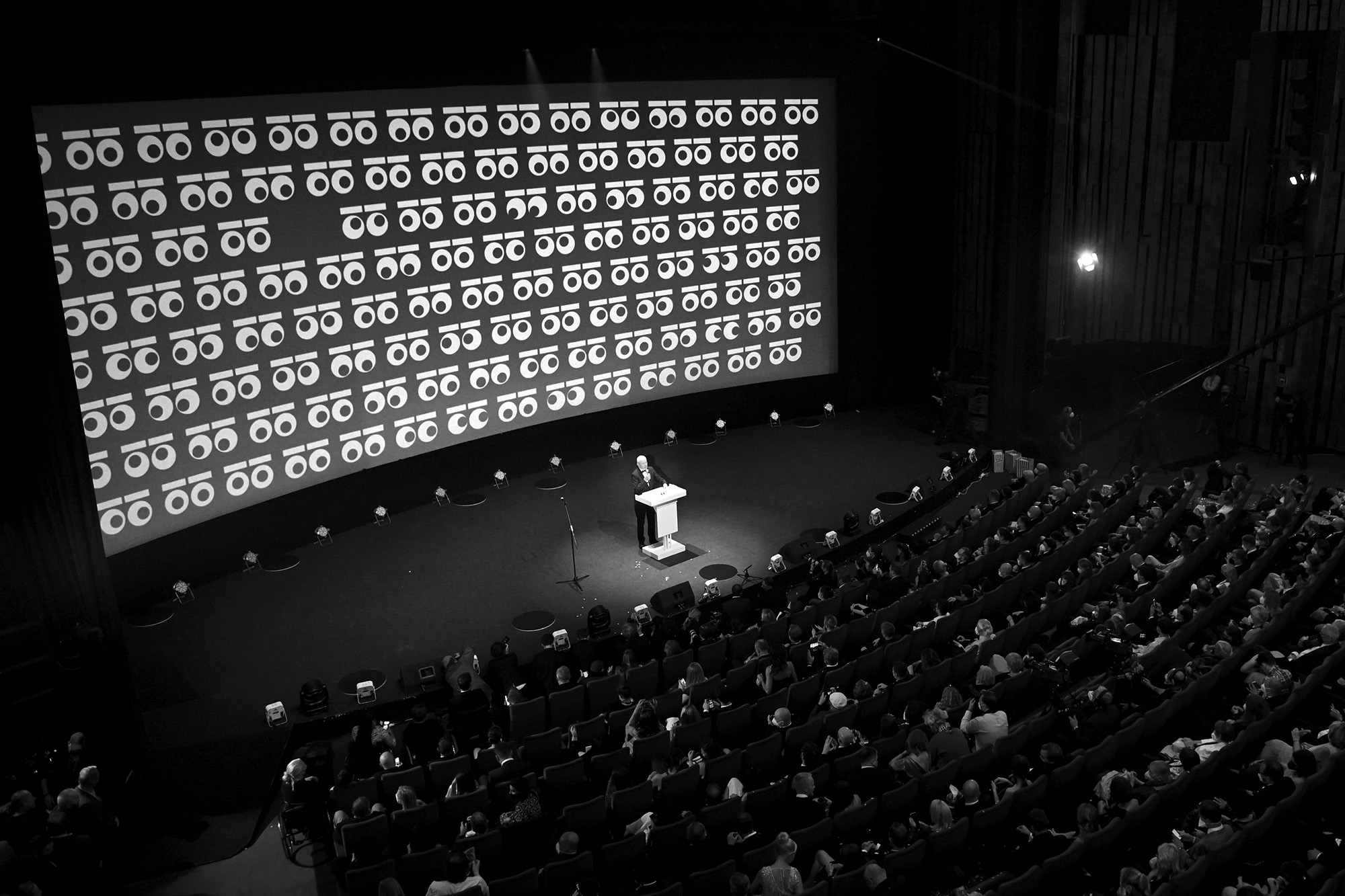
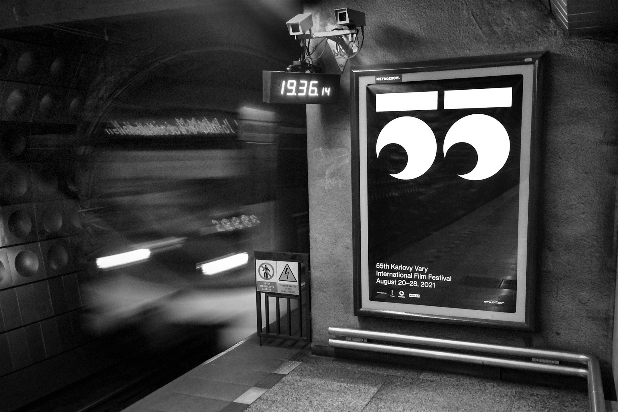
visual identity for the 55th Karlovy Vary International Film Festival
2021 Graphic Designer of the Year
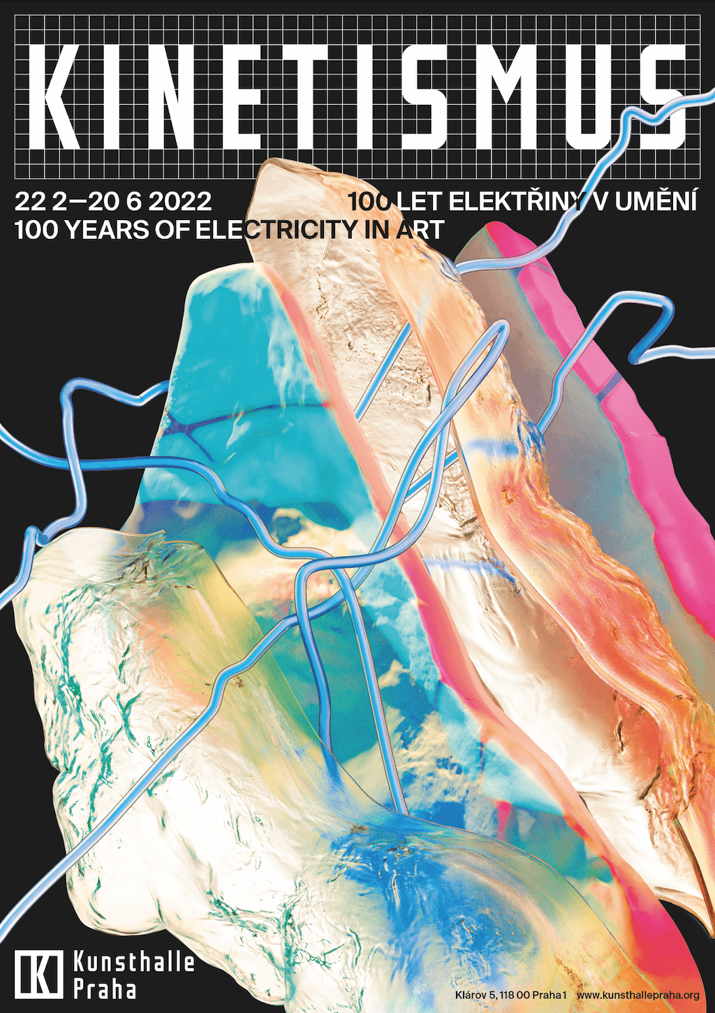
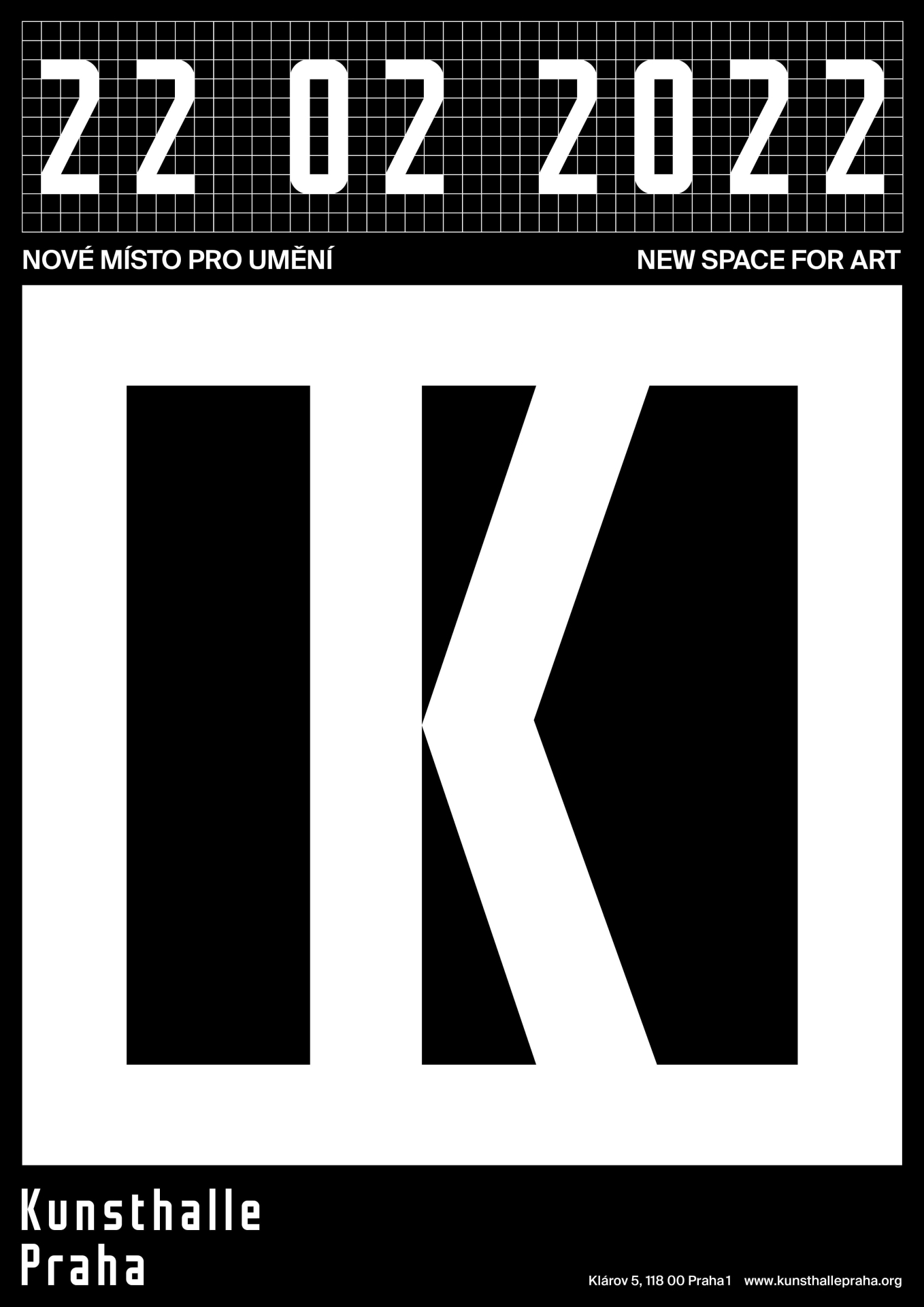
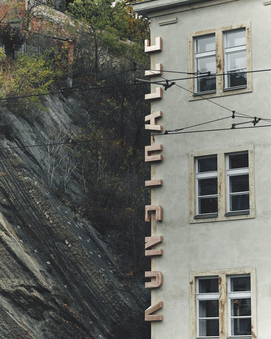
Studio Najbrt (Andrea Vacovská, Marek Pistora, Zuzana Lednická, Aleš Najbrt, Zdeněk Trinkewitz)
visual identity for Kunsthalle Praha
2020 Graphic Designer of the Year
Studio Najbrt (Zuzana Lednická)
graphic design of the accompanying poster and book for the film V síti
2019 Graphic Designer of the Year
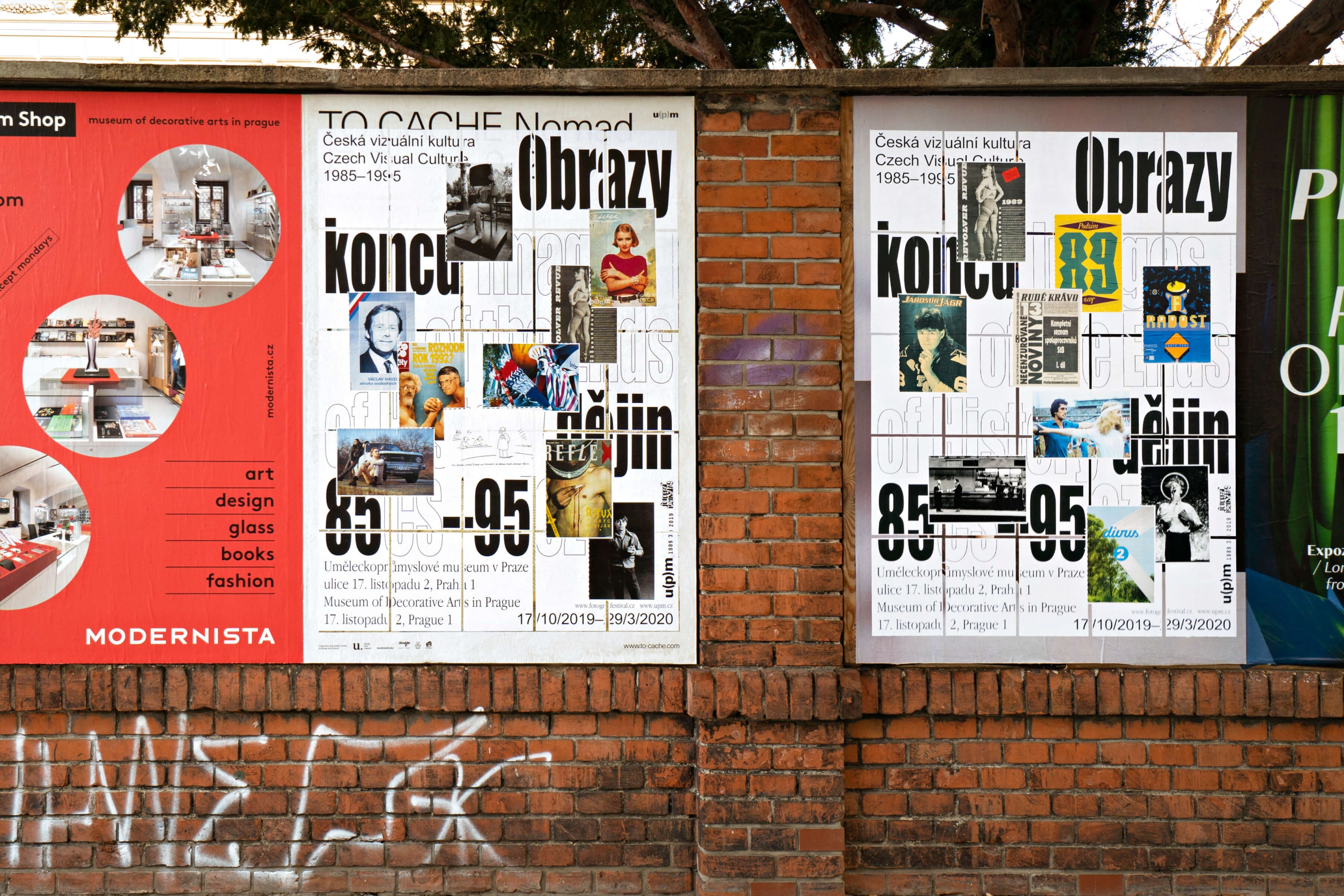
Studio Najbrt (Zuzana Lednická)
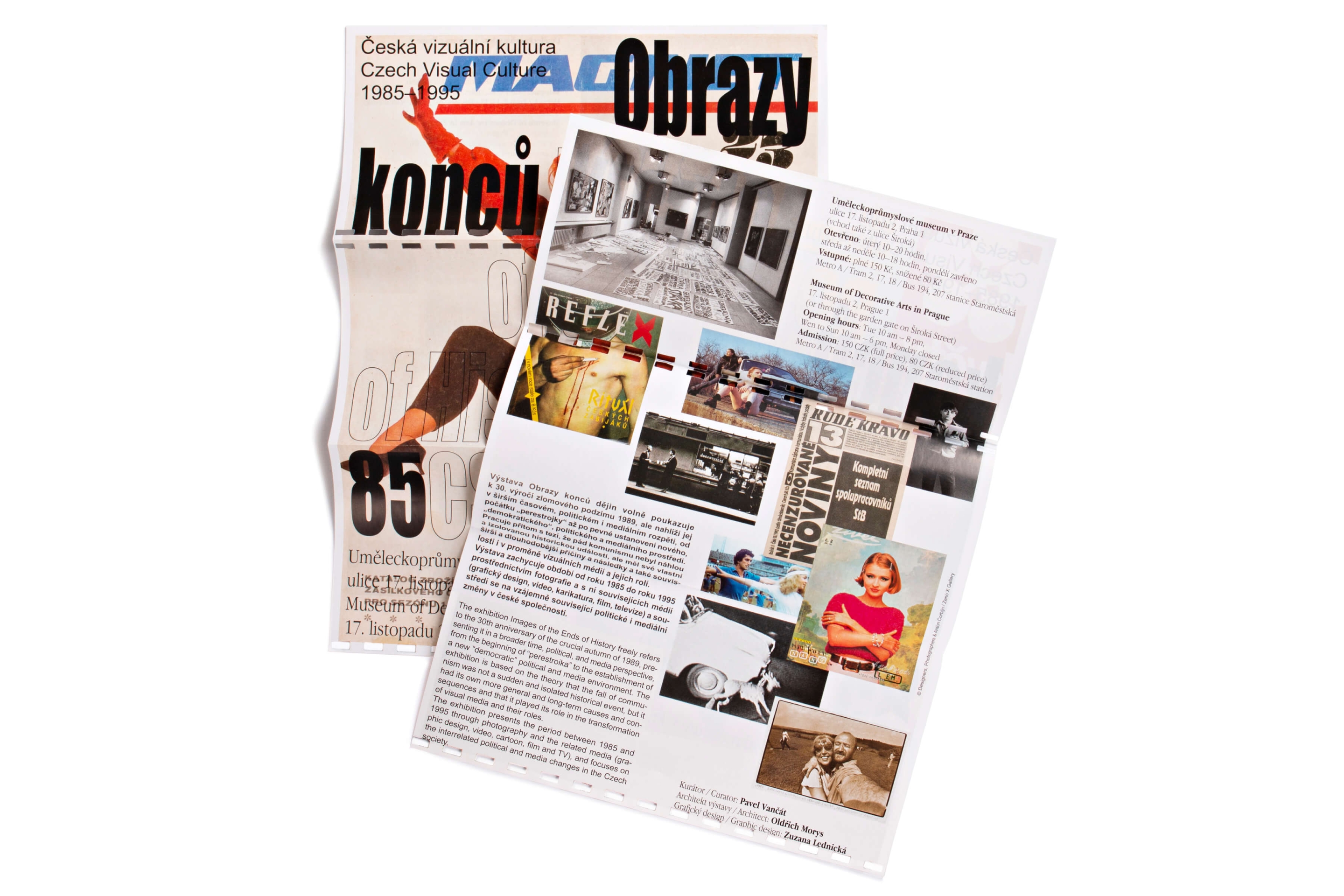
graphic style for the exhibition Images of the Ends of History: Czech Visual Culture 1985–1995 (UPM)
2018 Graphic Designer of the Year
Studio Najbrt (Marek Pistora)
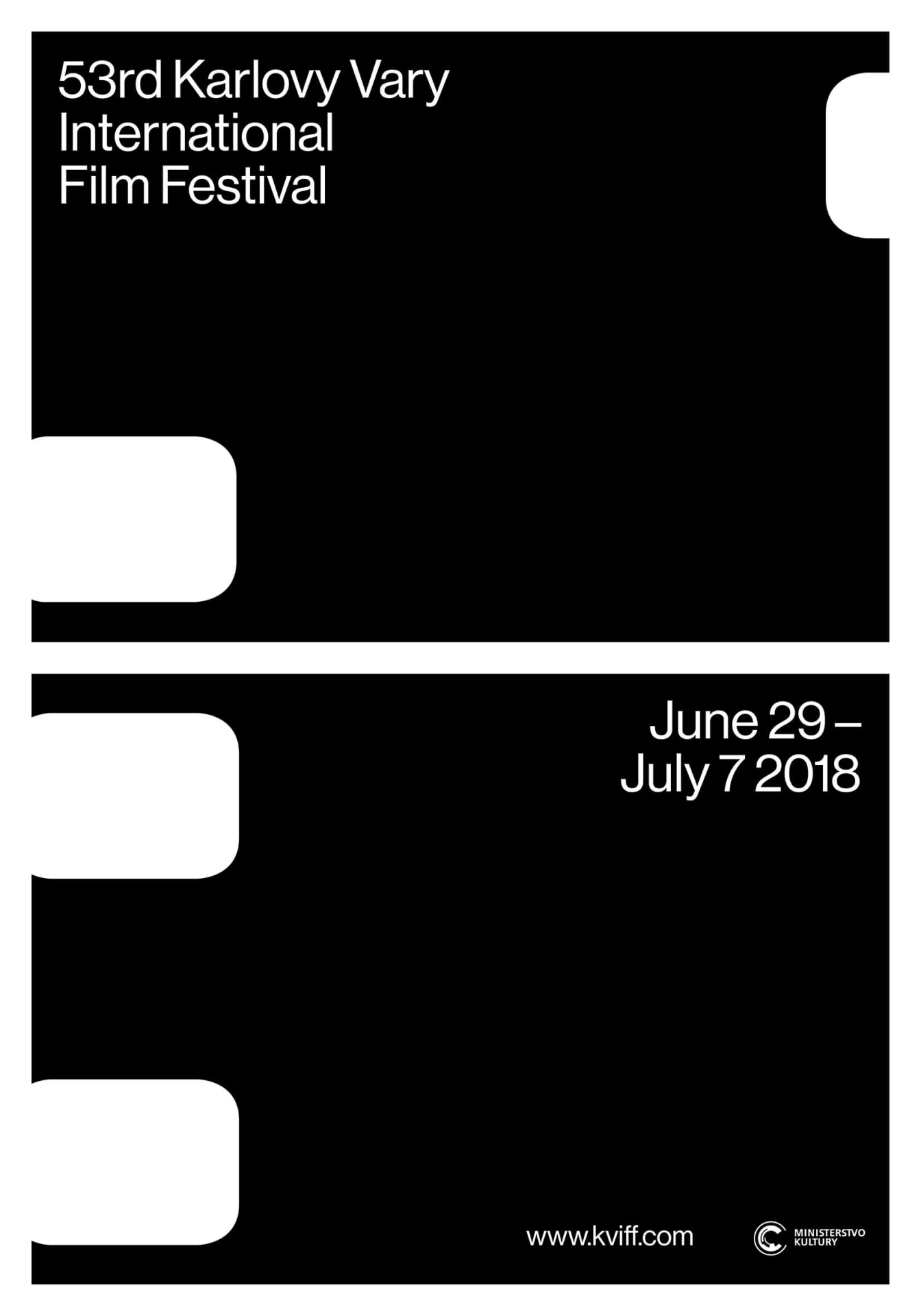
visual identity for the 53rd Karlovy Vary International Film Festival
2018 Graphic Designer of the Year
Studio Najbrt
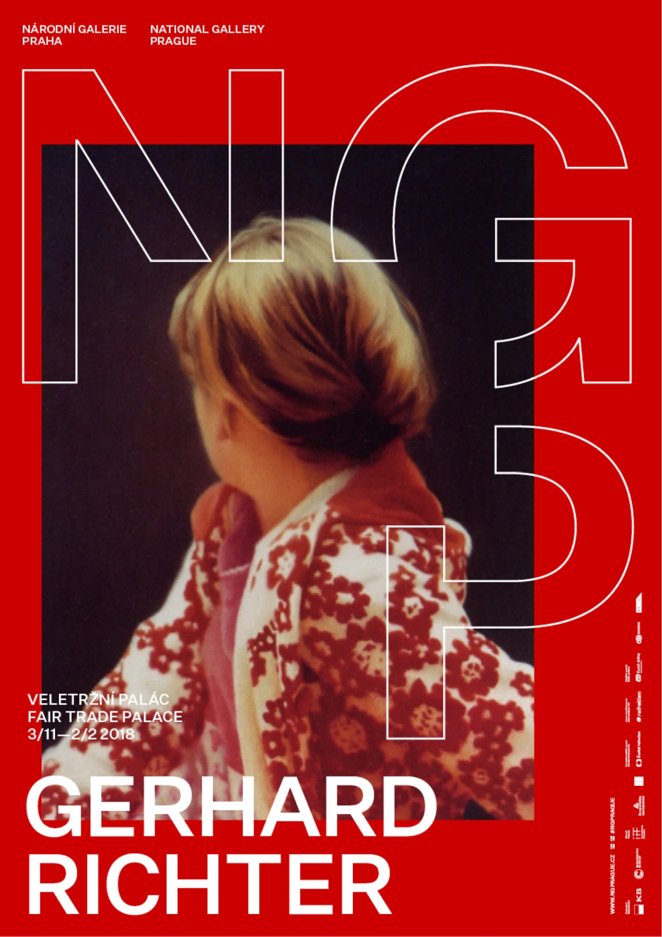
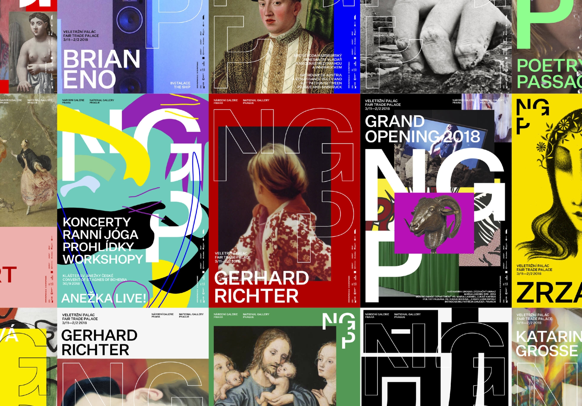
visual identity for National Gallery Prague
2017 Graphic Designer of the Year
Studio Najbrt (Martin Vácha, Aleš Najbrt, Zuzana Lednická)
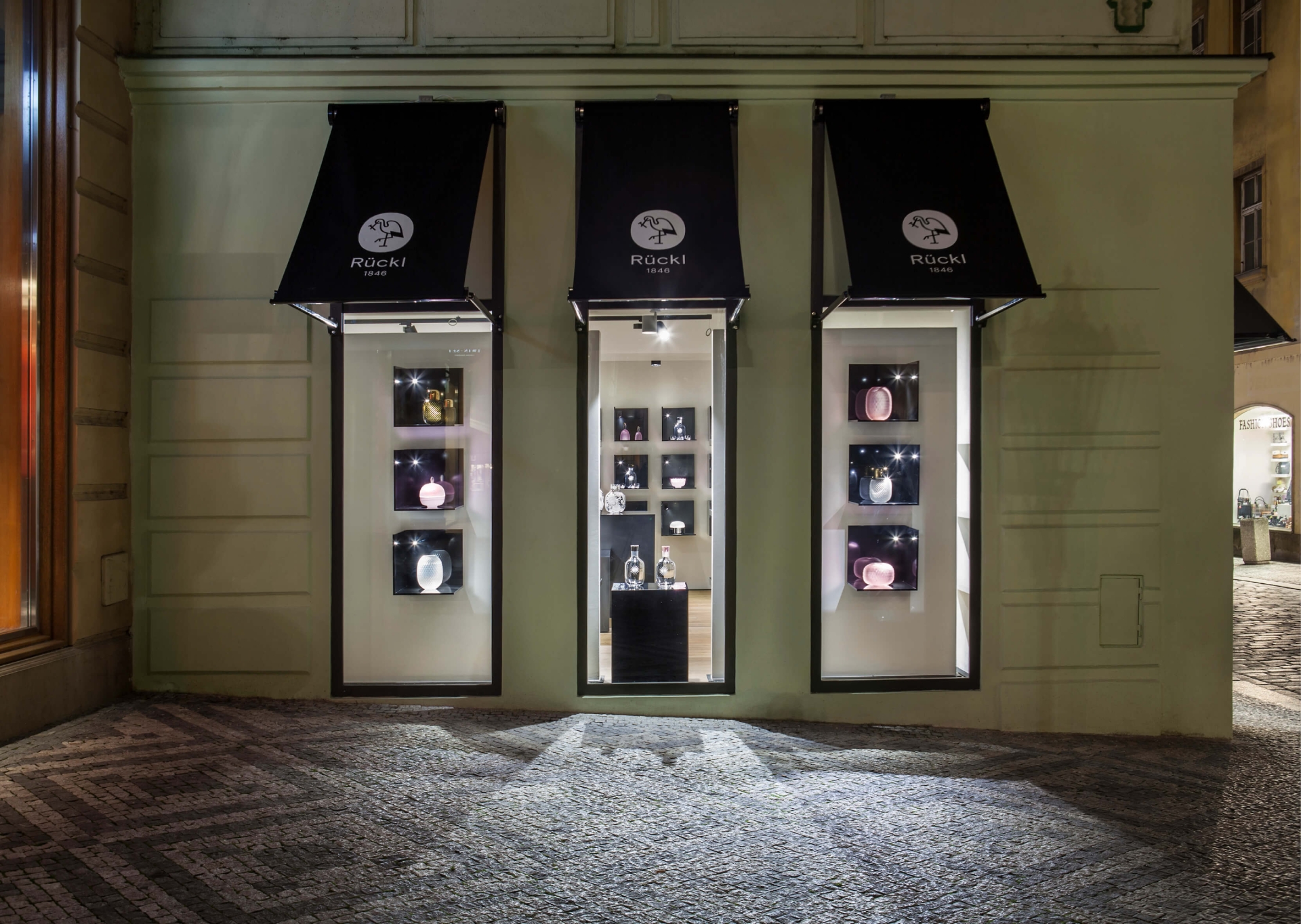
visual style for the revitalized Rückl brand
2016 Graphic Designer of the Year
Studio Najbrt (Marek Pistora)
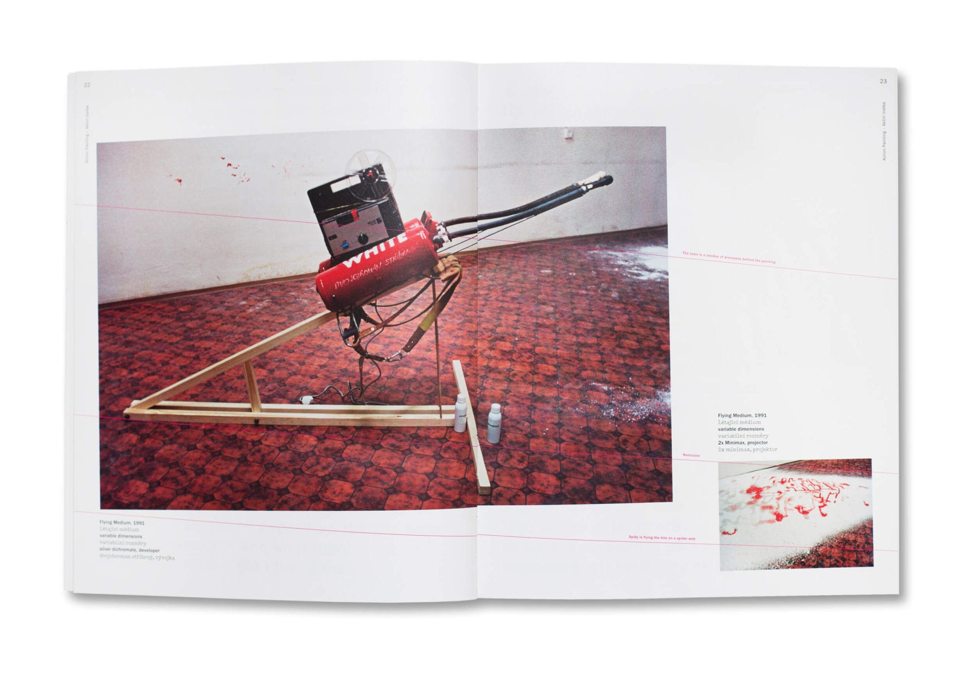
concept and visual rendition of the publication Jiří Černický: Dolby Malba
2016 Graphic Designer of the Year
Studio Najbrt (Marek Pistora, Michal Nanoru, Aleš Najbrt)
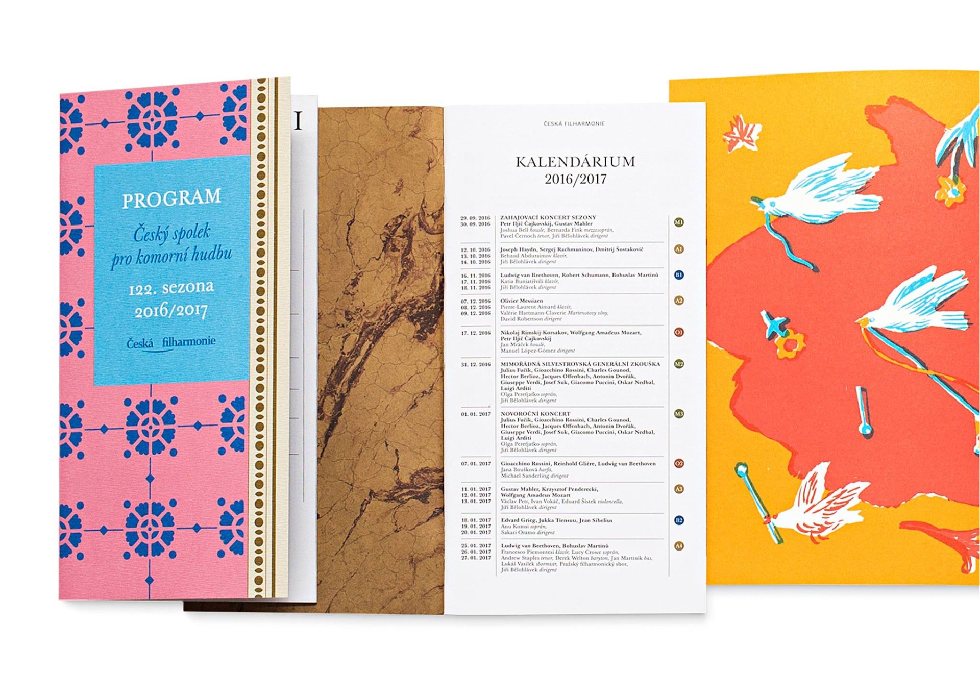
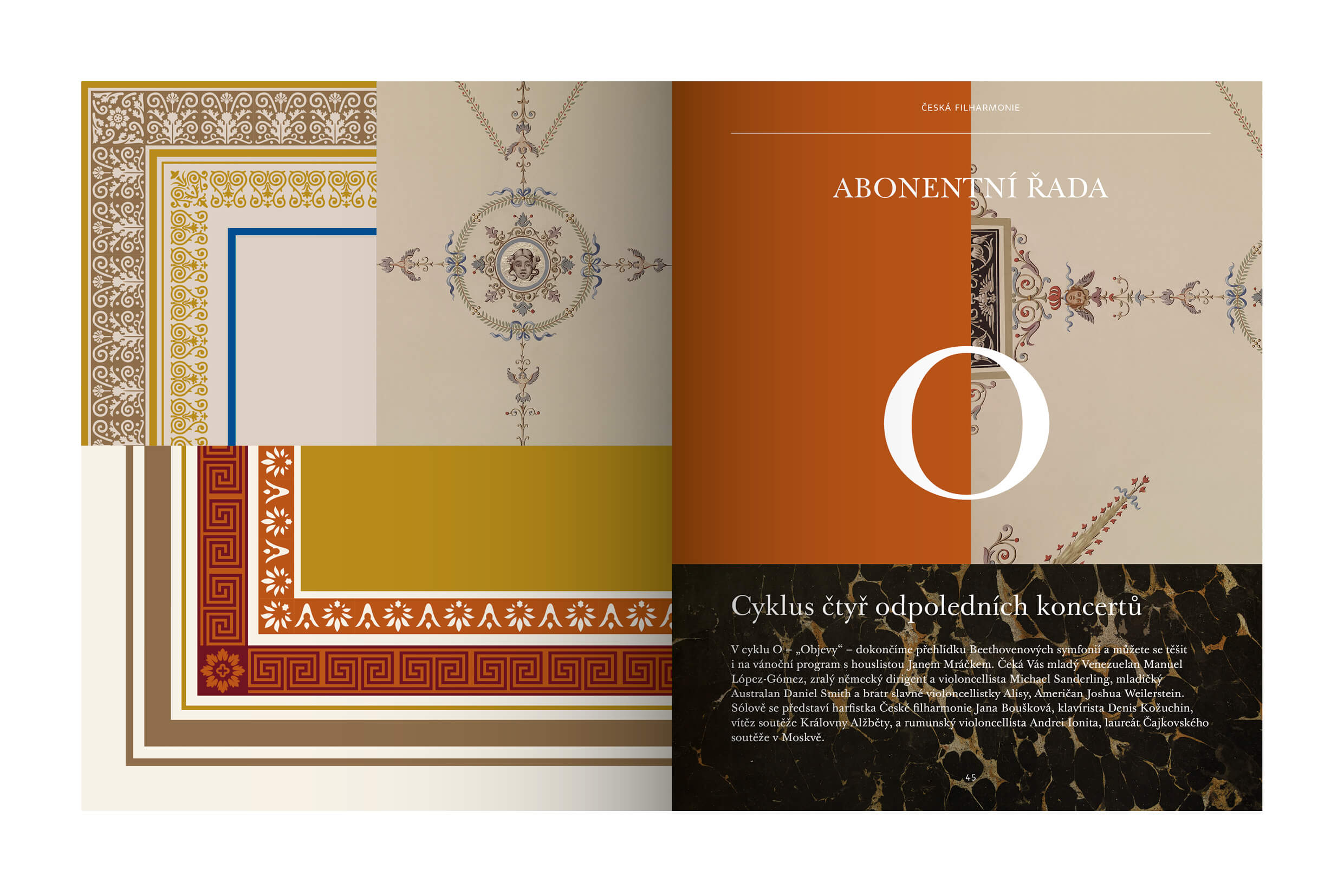
visual style of the 2016/2017 season for the Czech Philharmonic
The visual solution of the 2016/2017 concert season of the Czech Philharmonic Orchestra was developed on the concept which Studio Najbrt produced for last year's 120th anniversary of the foundation of this very first Czech ensemble (the authors of the graphic design are Marek Pistora and Michal Nanoru). The open graphic concept, derived from the orchestra's historical cultural renown and its close links with the Rudolfinum building in Prague, finds its individual form in posters, programs, program catalogues and their language versions.
Contrary to the style of the previous season, which only slightly touched upon the aesthetics of the era when the first Philharmonic Orchestra's programs were issued, the most recent style fully employs "both the decorative gluttony and the subtle details of the Rudolfinum's decoration" (see the website of the studio). The applications work most efficiently in the concert hall itself, where the walls and ceilings come alive, freely spill over into the printed brochures and flutter in the programs held in the visitors' hands. Those who are more traditionally oriented can perceive the new visual concept as pleasantly comforting, making them feel that the world here has retained its stability and is anchored in clearly outlined, decorative schemes softly perched in the historical memory. More suspicious visitors, however, cannot fail to see a certain spitefulness with which the ornamental painted decorations, the Classical Antiquity-like and Renaissance grotesques, garlands, mascaron ornaments, amoretti, allegorical figures, but also paraphrased fragments of architecture and other free visual quotes are layered over one another, thus resulting in visual "chords" or, on the opposite, dissonances. The impression of overstatement is evoked by employing various proportions and color scales. Another oscillating element is the degree of abstraction and faithfulness to the model, while the decorative swatch is also directly being disturbed by some contemporary graphic features from time to time, which seems as if it has been incidentally lured from among the literal ornamental references - this is, for example, the case of illustrations by Alexey Klyuykov for children's educative programs.
Pavla Pauknerová
2015 Graphic Designer of the Year
Studio Najbrt
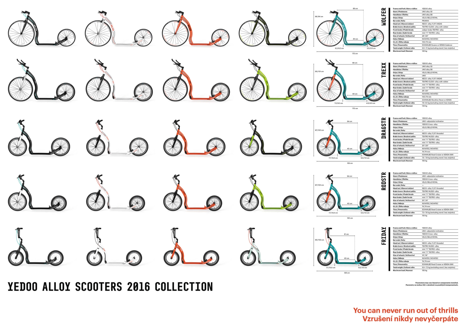
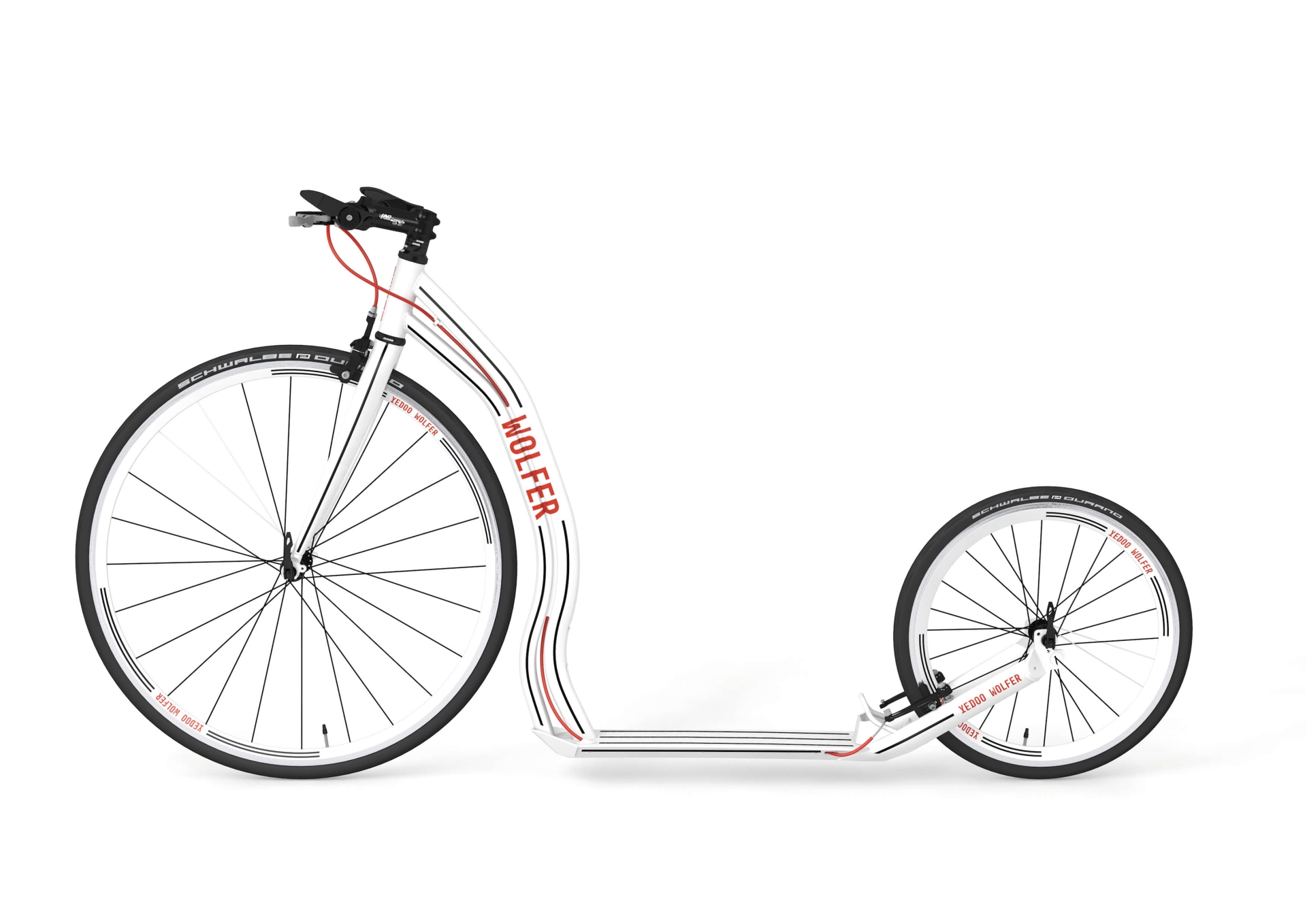
graphic design for the Alloy collection (Yedoo)
2014 Graphic Designer of the Year
Studio Najbrt
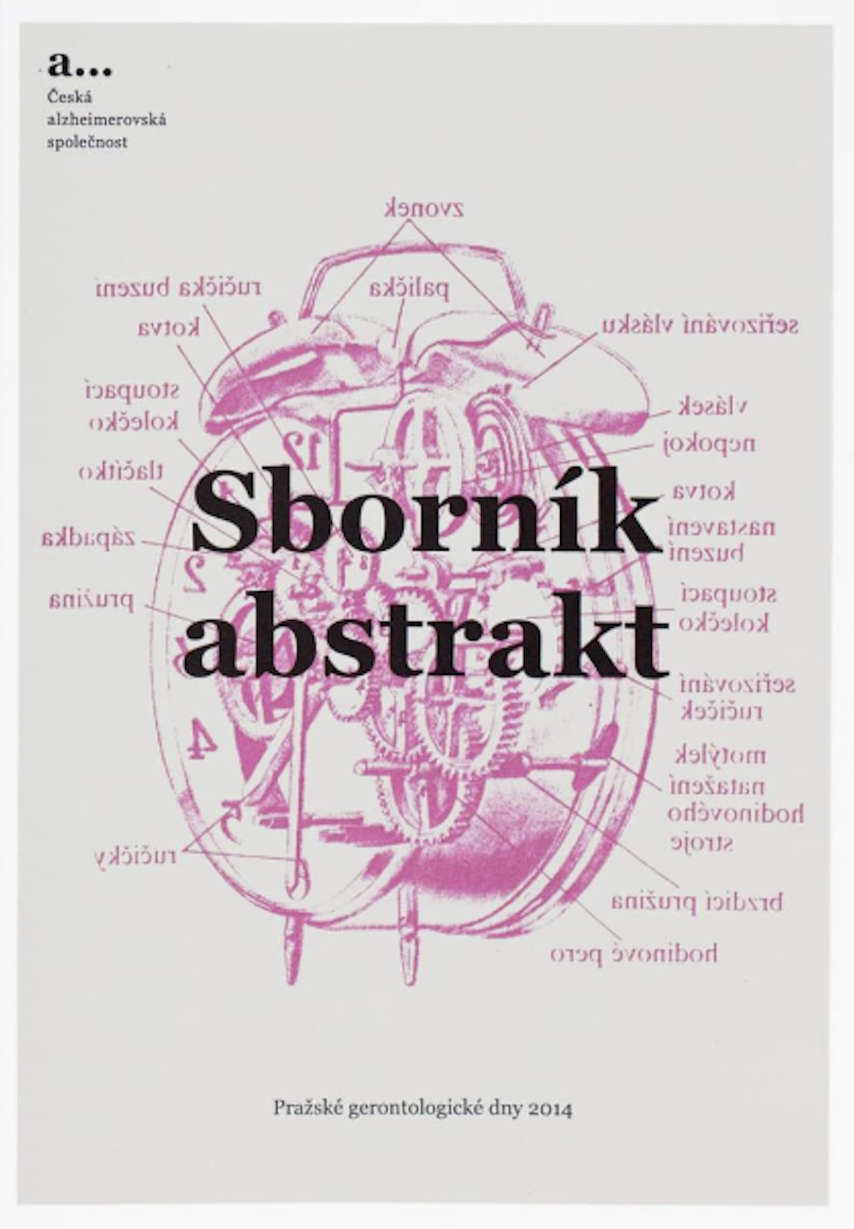
bulletin and visuals for the Czech Alzheimer Society
2013 Graphic Designer of the Year
Studio Najbrt
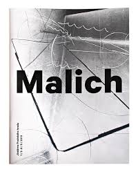
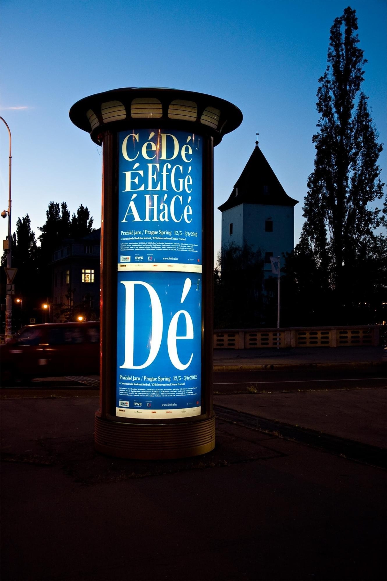
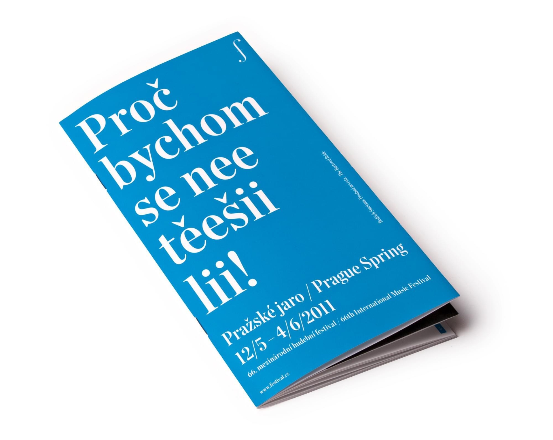
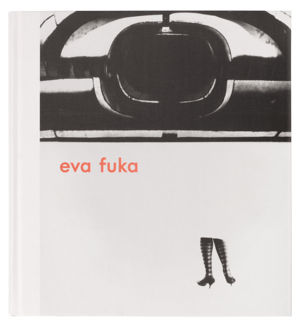
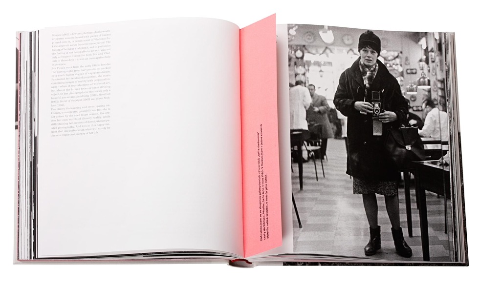
visual style of the Prague Spring International Music Festival, monograph of Eva Fuková and exhibition catalog for Karel Malich
2012 2 Graphic Designer of the Year
Studio Najbrt
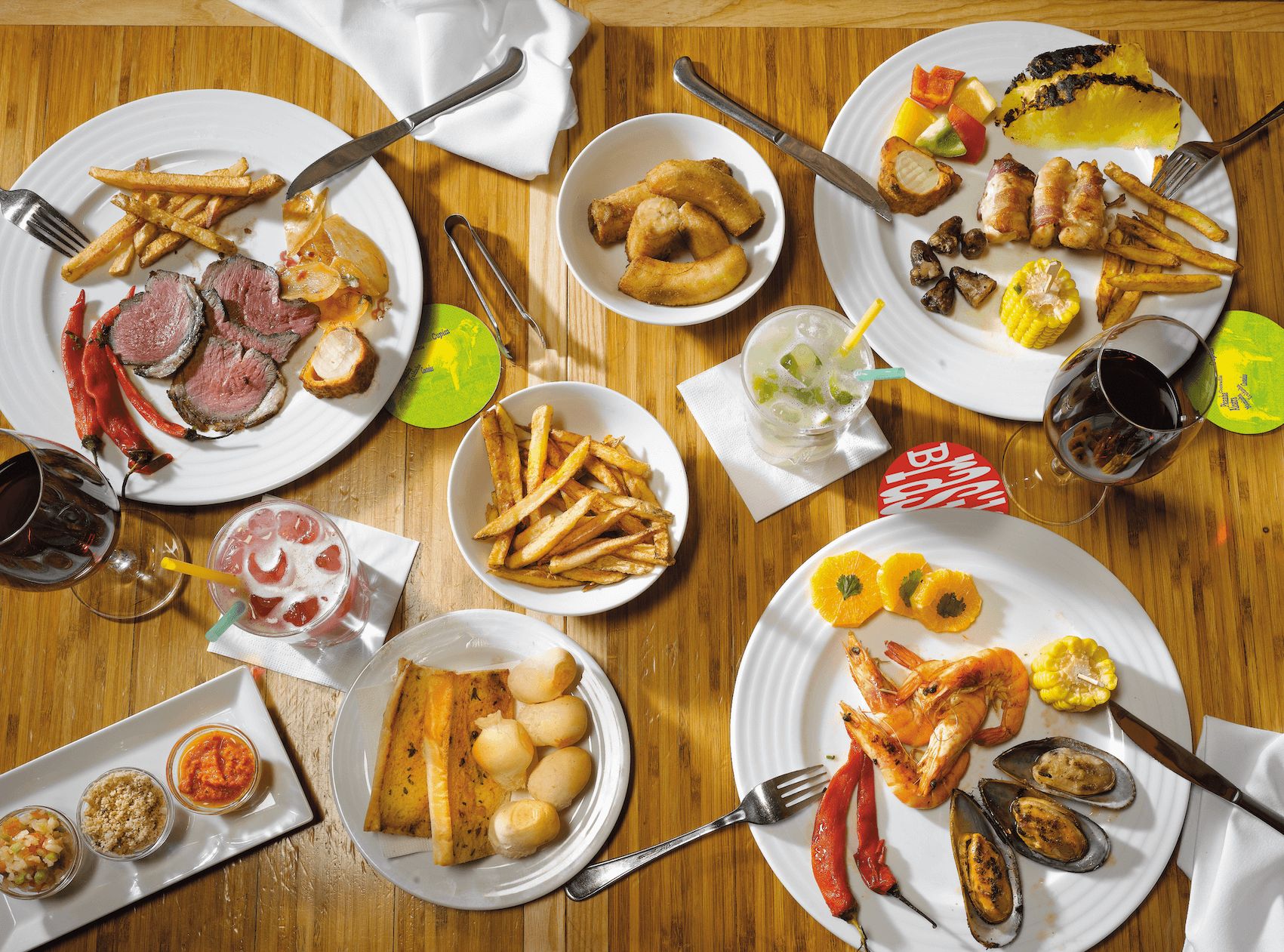
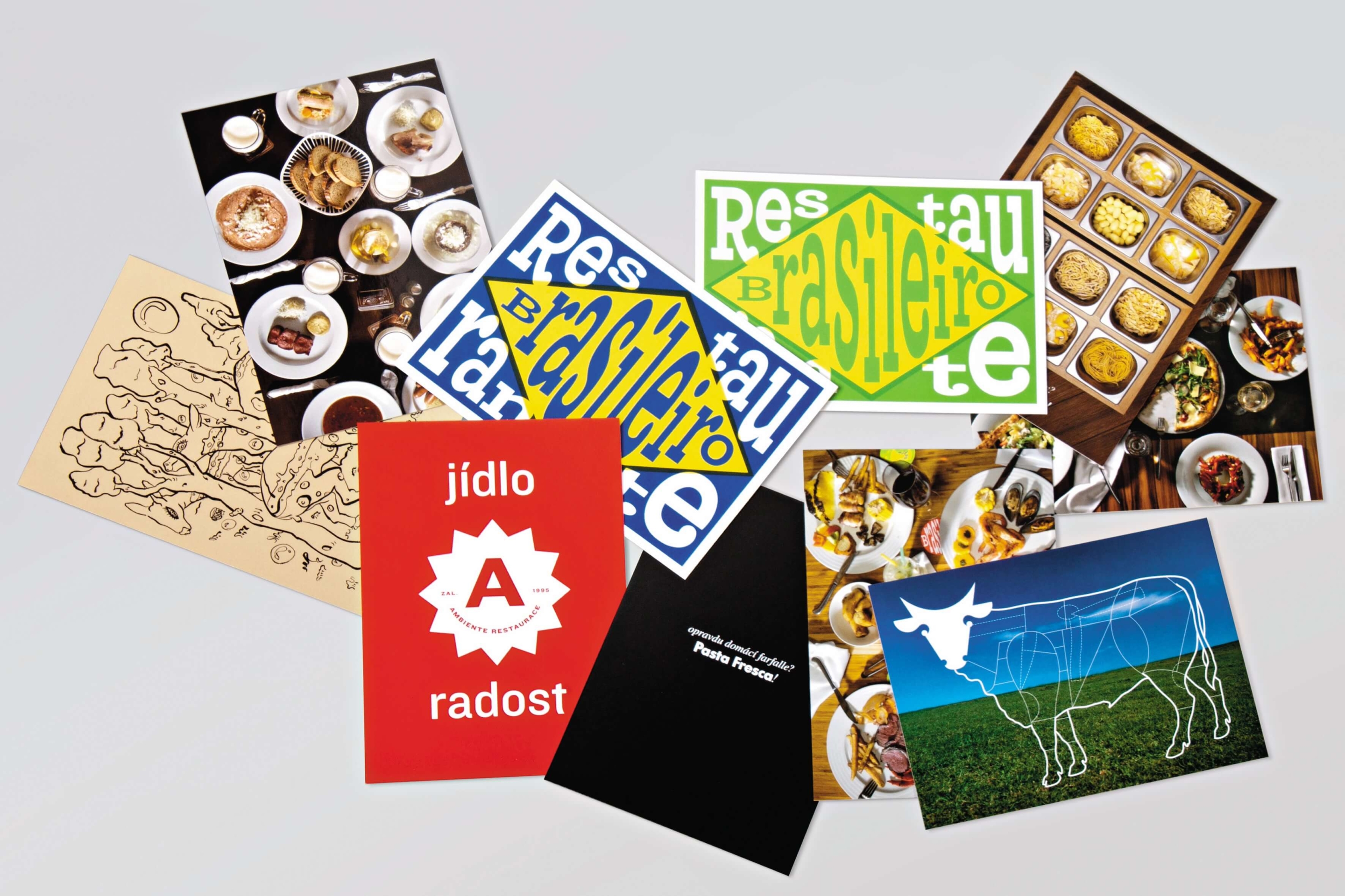
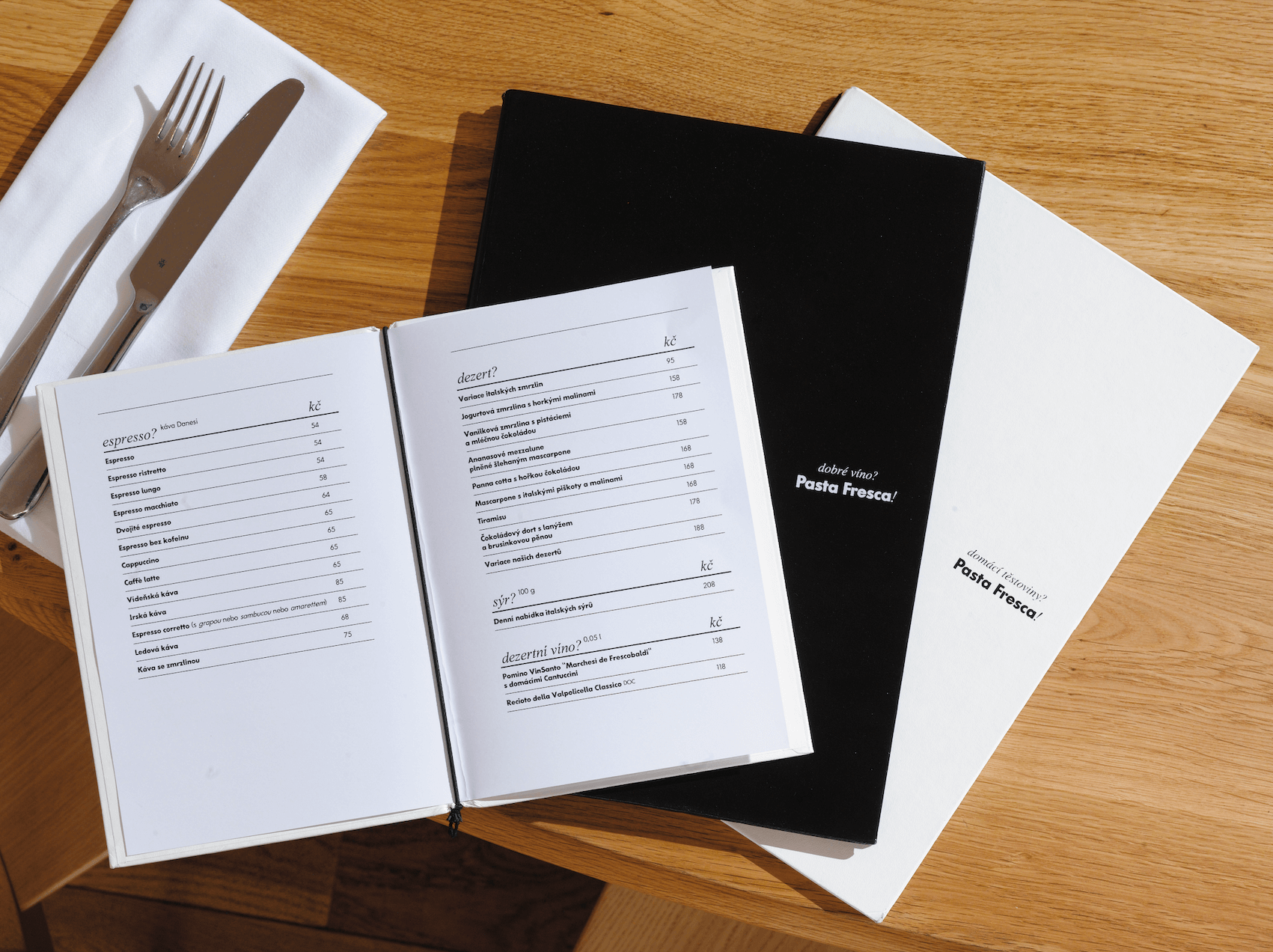
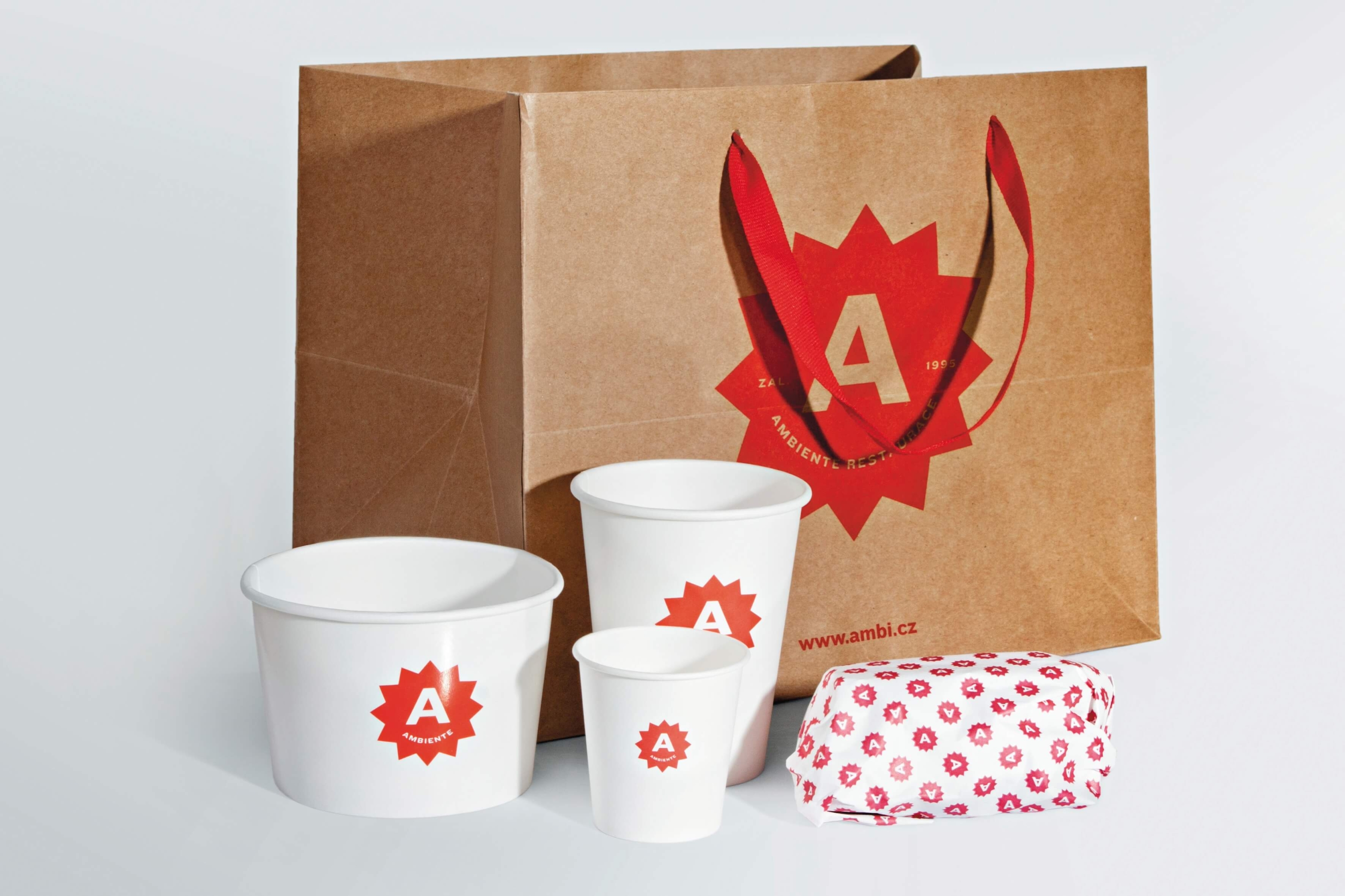
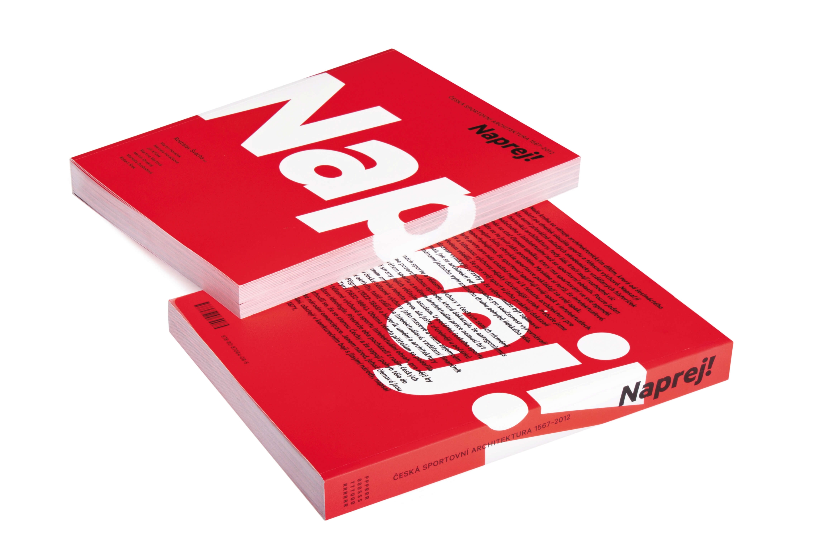
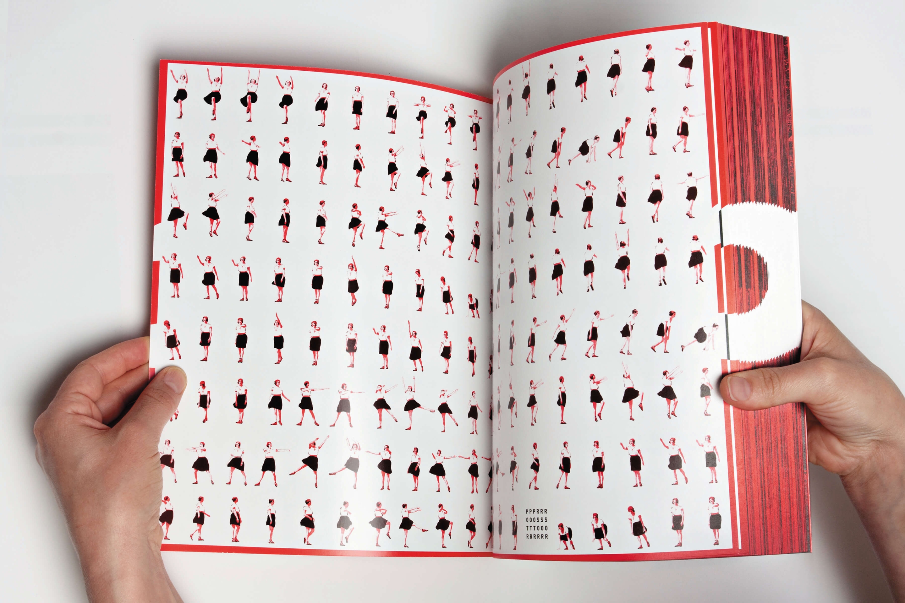
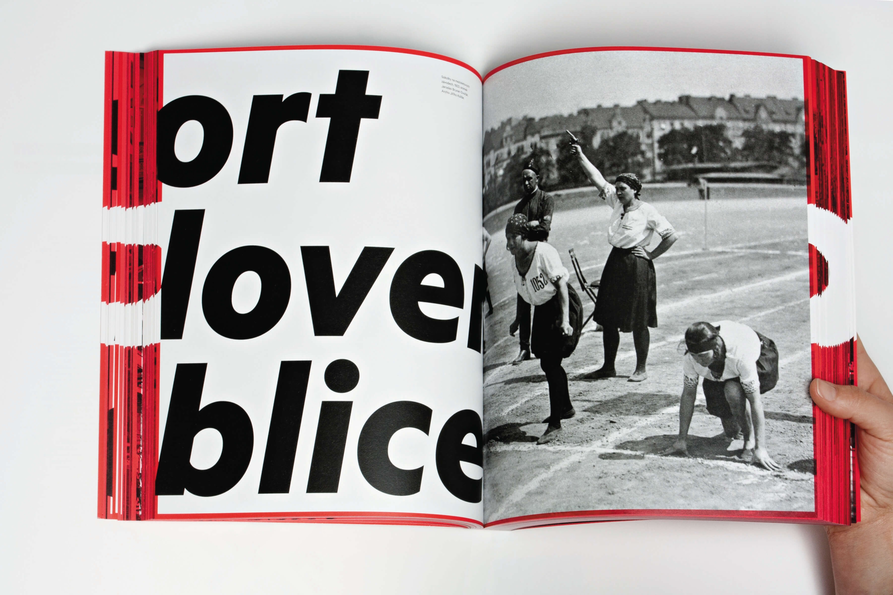
redesign of Ambiente restaurants and the book Naprej!
"We created independent individual brands that correspond with their specialisation, plus we transformed the previous umbrella brand of Ambiente which represents the hallmark of quality into the form of a star."
"Studio Najbrt represents a phenomenon on the Czech scene – it is the first creative studio established in the Czech Republic and has remained on the top of contemporary, yet user-friendly, design for over twenty years," explained Iva Knobloch on the studio's position in the Czech market. "This position ranks among those that are most difficult to achieve, seen from a long-term perspective. Charismatic Aleš Najbrt is able to build up his collaborators, both clients and studio members, accordingly. We might even call it the "najbrtesque" style of visual communication: austerity, straightforwardness, optimism." Apart from many other projects, they spent the last year working for the Ambiente chain of restaurants. Even though each of them has its own original style and cuisine, they all have a single common denominator. The visual style of the individual restaurants was created by Studio Najbrt members Zuzana Lednická (Hospoda, La Degustation), Martin Vácha (Pasta Fresca), Petr Štěpán (Čestr and Brasileiro), and Marek Pistora under the supervision of Aleš Najbrt. The graphic design for the book, Naprej!, on sports facilities was crafted by Bohumil Vašák. Studio Najbrt won the 2007 Graphic Designer of the Year Award and features among the nominees on a regular basis.
2011 Graphic Designer of the Year
Studio Najbrt
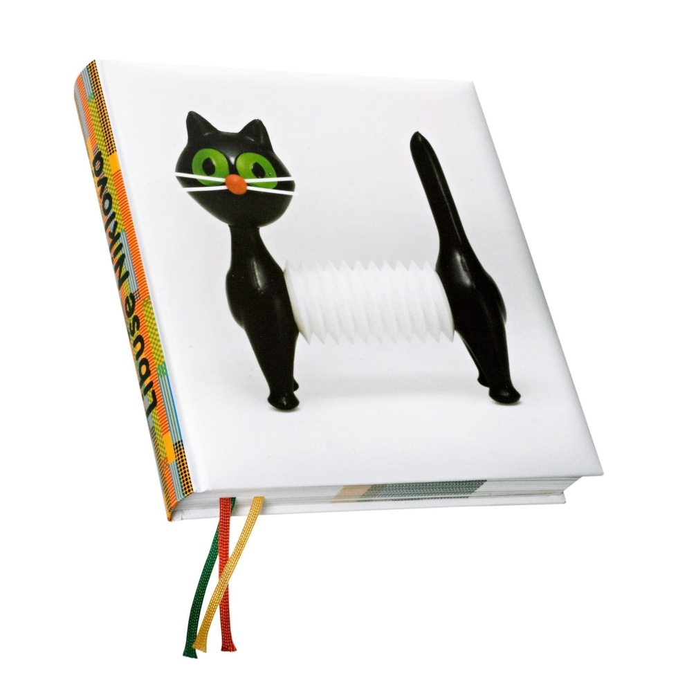
visual style for Čestr restaurant, the book Urban Interventions (Slovart) and graphic design for the exhibition Plastique ludique by Libuše Niklová in Paris
2010 3 Graphic Designer of the Year
Studio Najbrt
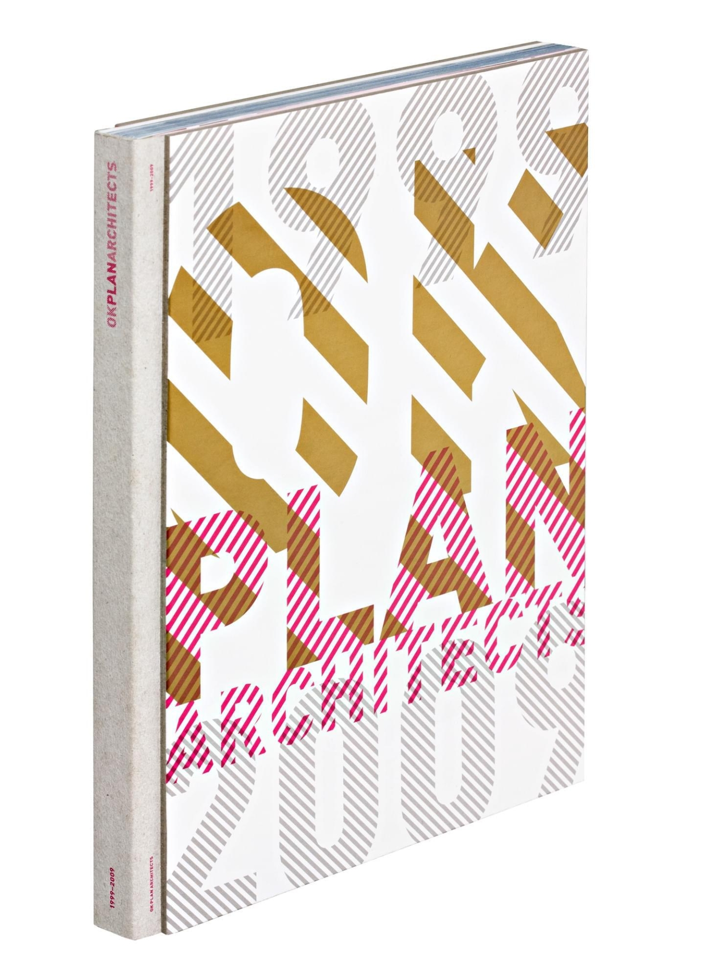
graphic design for the book and exhibition of Libuše Niklová, visual style for Toxique, graphic design for Plan Architects
2009 Graphic Designer of the Year
Studio Najbrt
the exhibition Three Exclamation Points, visual style of the 44th Karlovy Vary International Film Festival and posters for National Theater Drama
2008 Graphic Designer of the Year
Studio Najbrt
children
2007 1 Graphic Designer of the Year
Studio Najbrt (Zuzana Lednická, Aleš Najbrt)
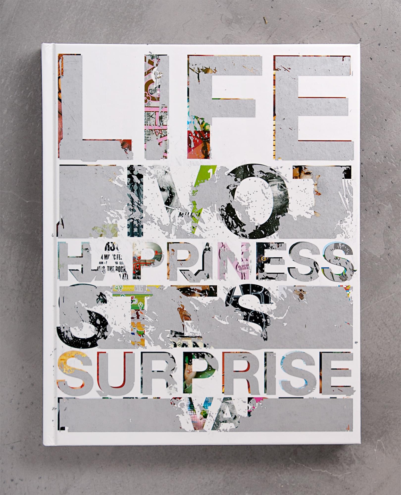
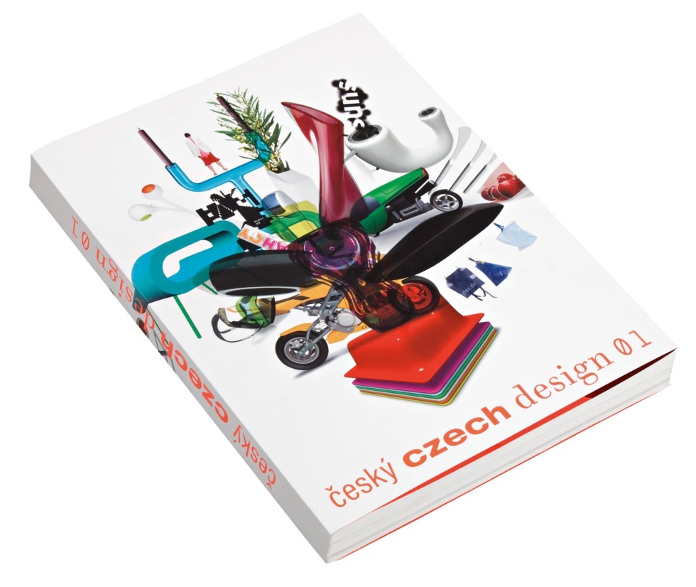
design and style for the MojeMoje label, the studio monograph Life Happiness Surprise, graphic design of the book Czech Design 01, new orientation system for Czech Railways
2006 Graphic Designer of the Year
Studio Najbrt
visual style for the 42nd Karlovy Vary International Film Festival
We use cookies on our website to give you the most relevant experience by remembering your preferences and repeat visits. By clicking “Accept”, you consent to the use of ALL the cookies. However you may visit Cookie Settings to provide a controlled consent.
This website uses cookies to improve your experience while you navigate through the website. Out of these cookies, the cookies that are categorised as necessary are stored on your browser as they are essential for the working of basic functionalities of the website. We also use third-party cookies that help us analyse and understand how you use this website. These cookies will be stored in your browser only with your consent. You also have the option to opt-out of these cookies. But opting out of some of these cookies may have an effect on your browsing experience.
Necessary
Necessary cookies are absolutely essential for the website to function properly. These cookies ensure basic functionalities and security features of the website, anonymously.
Analytics
Analytical cookies are used to understand how visitors interact with the website. These cookies help provide information on metrics the number of visitors, bounce rate, traffic source, etc.
Performance
Performance cookies are used to understand and analyse the key performance indexes of the website which helps in delivering a better user experience for the visitors.
Advertisement
Advertisement cookies are used to provide visitors with relevant ads and marketing campaigns. These cookies track visitors across websites and collect information to provide customised ads.